Baggu: A Case Study in Retention
I love Baggu. I love their prints, their drops, their little ecosystems of charms and cases. And I especially love their model of being a sustainable brand - not something easy to accomplish in seemingly the time of fast fashion! As a dedicated brand evangelist, I felt compelled to inject their existing account page with their brand's energy.
What I Noticed
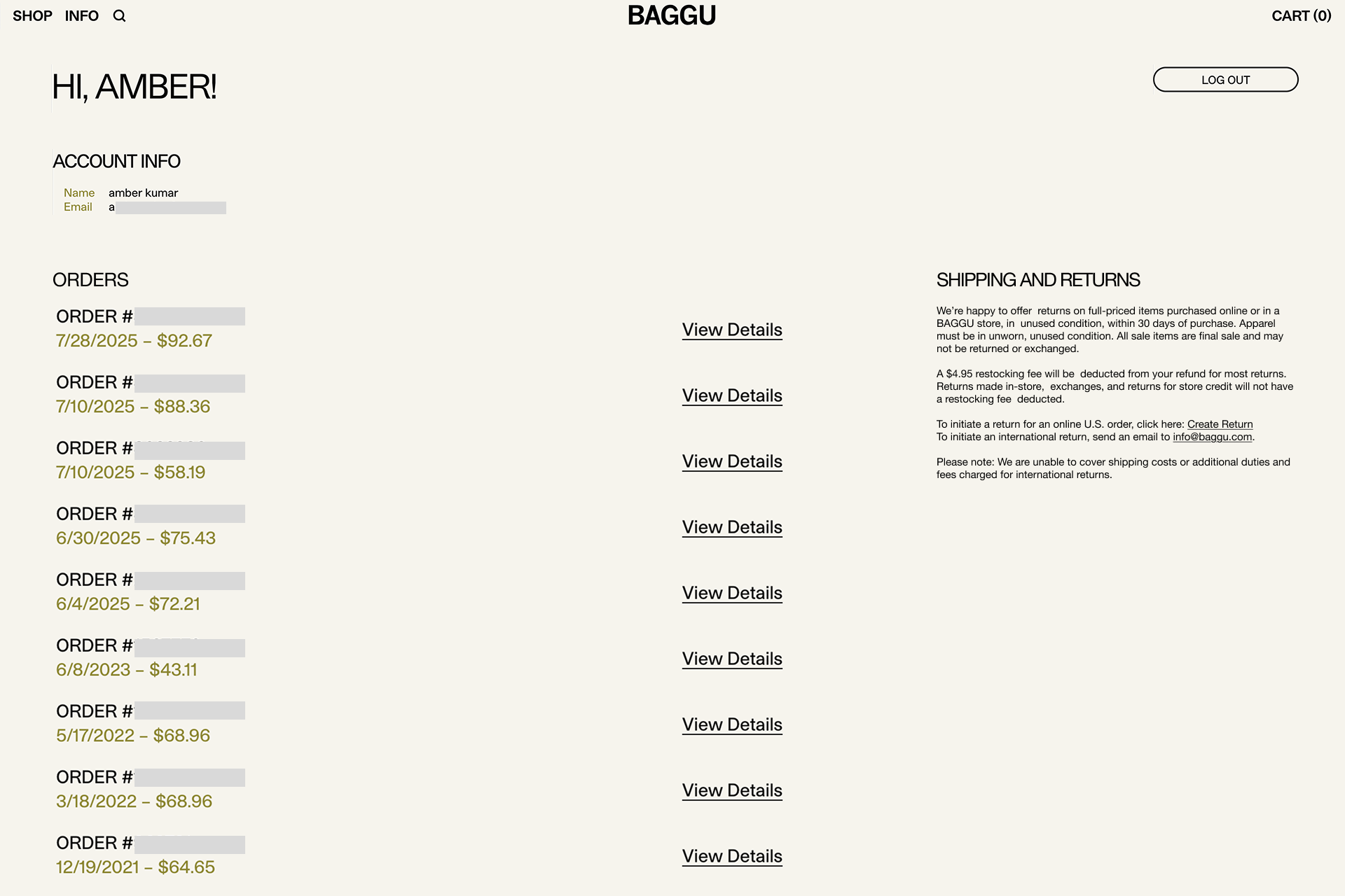
Baggu’s existing account page was pretty bare-bones. It had the essentials: your name, email, and a long list of order numbers, pretty much the bare minimum.
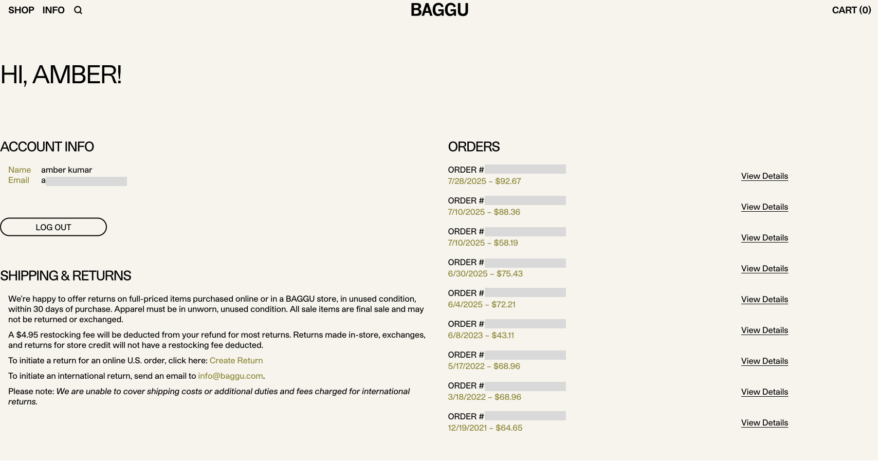
It wasn’t bad, but it felt like a missed opportunity. Baggu customers are not casual. They collect! They trade! They remember prints by name! I knew there was space to design something that aligned far better with the average Baggu Baddie.
As someone who loves great ecommerce design, and has the skills to do so, I wanted to showcase Baggu's brand identity while catering to their customers.
Looking at Other Reward Systems
Before I jumped into redesigning, I wanted to see how other brands use loyalty and account hubs to keep customers engaged. One example that stood out was ban.do’s Rewards page—bright, friendly, and actually fun to land on.
They also seem to have extremely similar demographics, and though ban.do sells Baggu on their site, since our concept strives to keep the customer on Baggu's site, it is a valid sample to use in a competitive analysis.
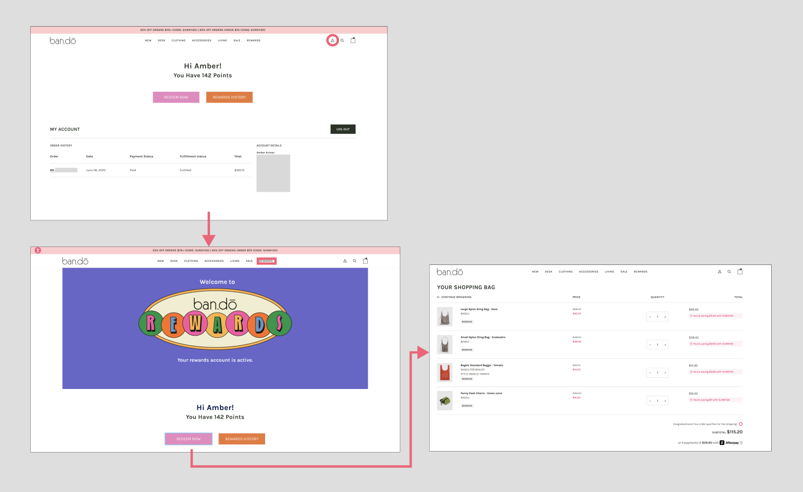
Though Bando's example is also very minimal, it made me wonder what it would be like if Baggu had something similar? Something that made you feel welcomed back and moreover, excited to continue your shopping experience.
The New Account Home
So I started with developing the account page, emphasizing the user's desires of being able to see everything at a glance.
I chose the placement of my modules carefully, I thought that since "Your Orders" was already present in a reduced form, that should take up the most amount of space. "Favorites" is a close second, as that is a fairly conventional part of ecommerce, but as "Inventory" is a lot more experimental, that has the least amount of screen real-estate.
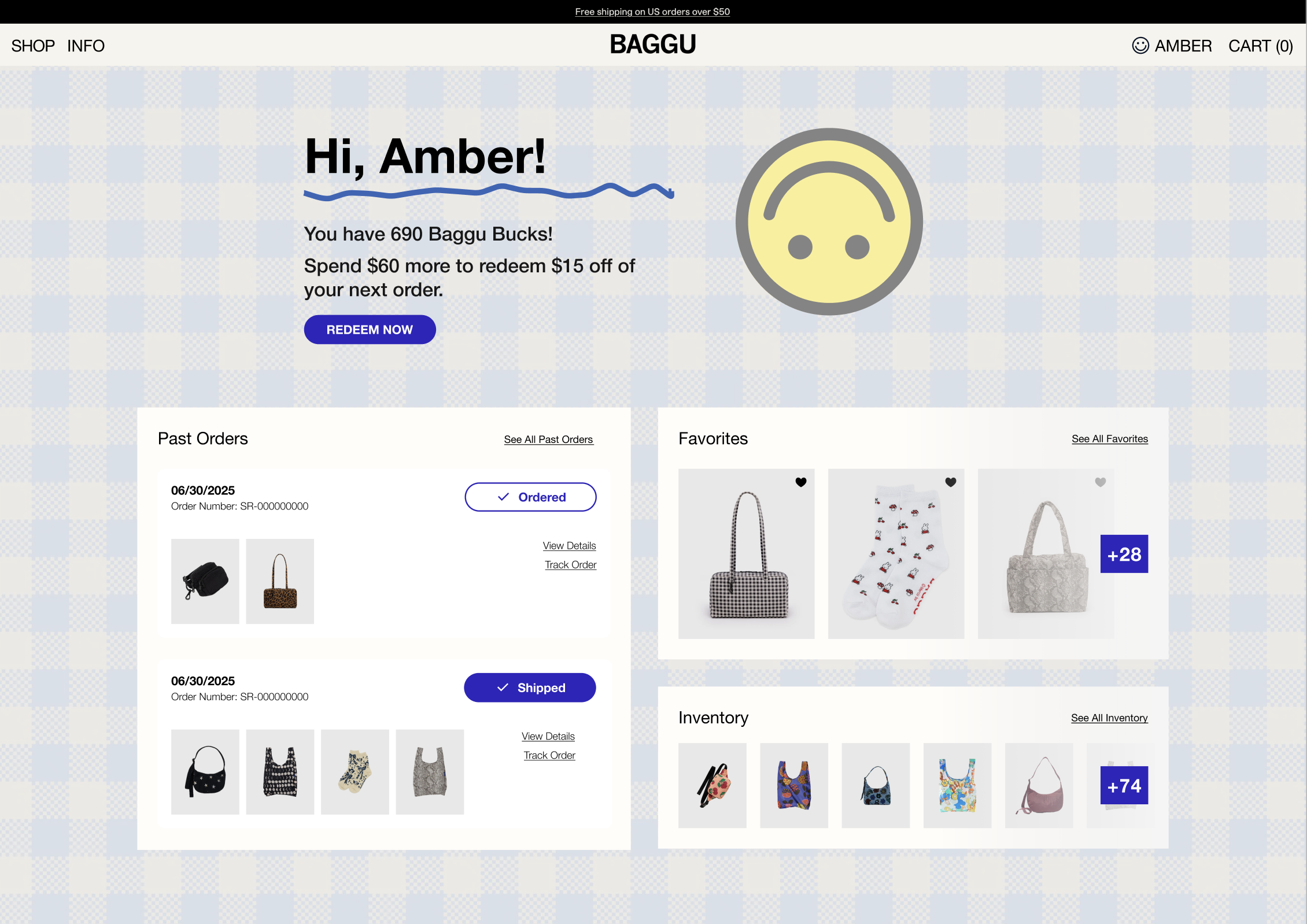
I introduced Baggu Bucks (I am not a copywriter), a clear reminder of how close you are to your next discount, and quick access to favorites, past orders, and your ever-growing inventory. Not only is this a fairly standard method of rewards, it is also something fairly easy to implement in Shopify, the ecommerce platform Baggu appears to be using.
Rethinking Past Orders
I also rebuilt the Past Orders page to match the rest of the redesign. Instead of a long text list, orders are grouped with product thumbnails and clear status labels.
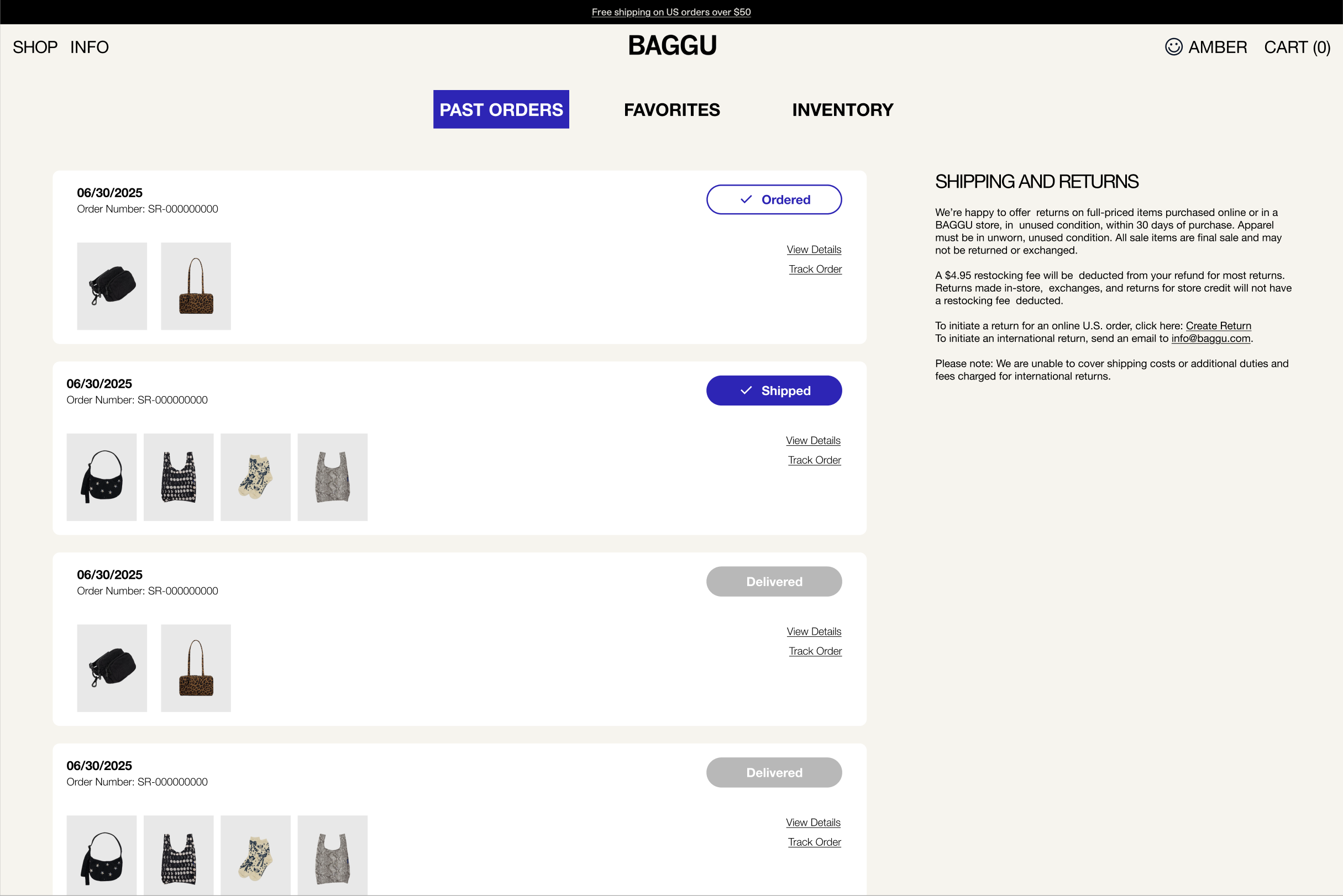
This makes it much faster to scan what the status of specific orders are. I didn't think it would be worth another click to have to track an order, in most cases, it's the whole reason you're on the page to begin with!
Favorites — A More Visual Wishlist
Baggu products are visual in nature. They have gorgeous prints and silhouettes, and you want to see them all together, like a digital sticker book.
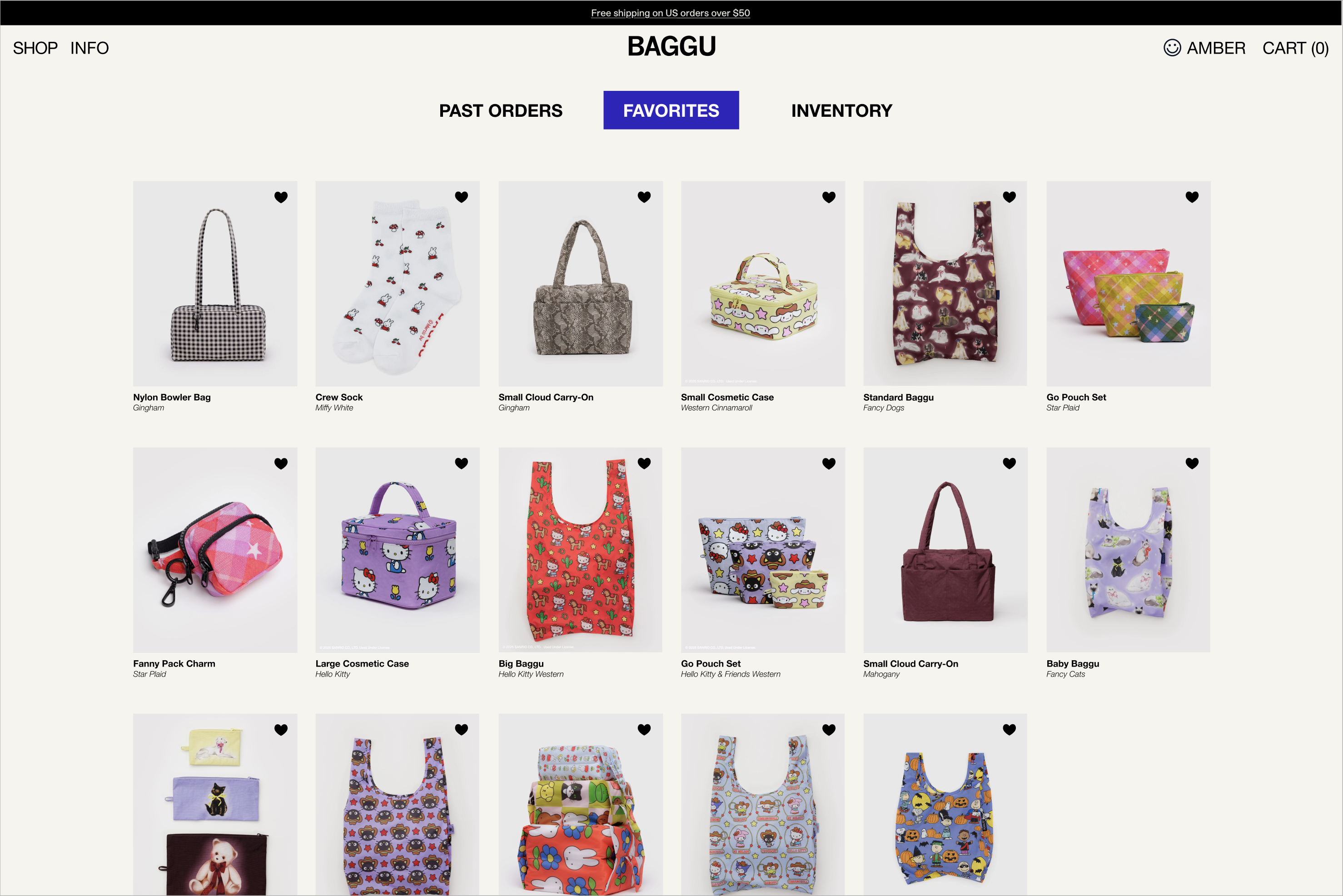
I expanded favorites into a full gallery. Big images. Big energy. Lots of prints staring back at you. It makes browsing your saved items feel like shopping your own curated shop. Also makes it easy to know what you can add to your cart to hit free shipping!
Your Baggu Inventory
Here’s where I had the most fun. Baggu fans often collect across categories, and I am certainly not exempt.
So I built one featuring my own collection, curated over years!.
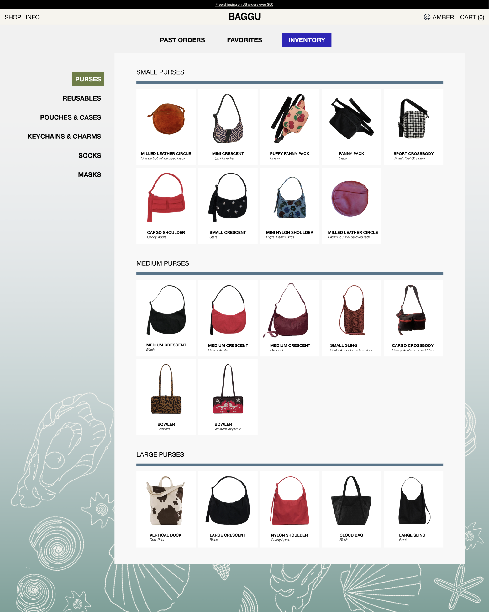
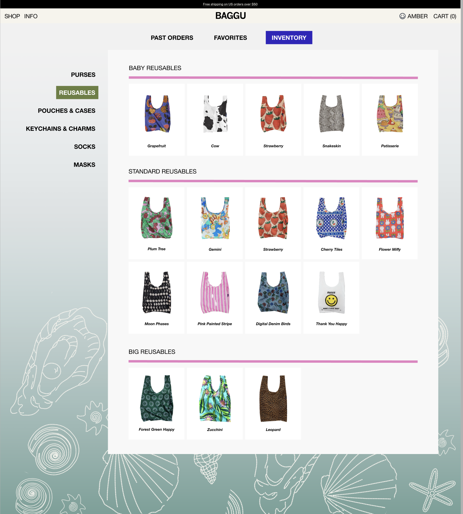
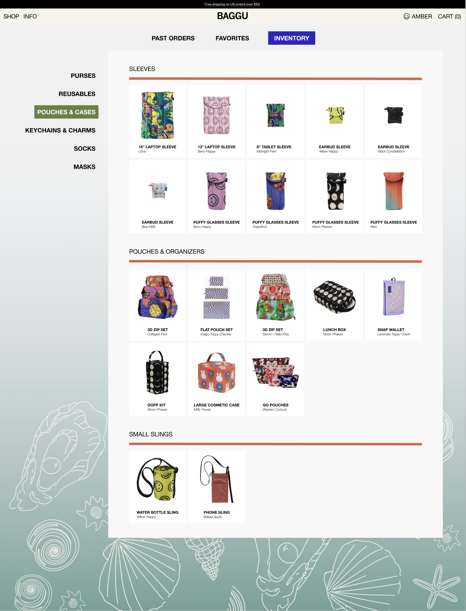
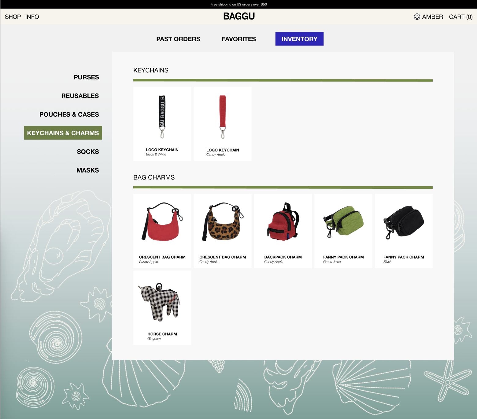
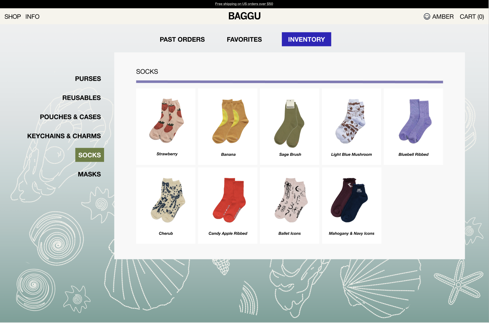
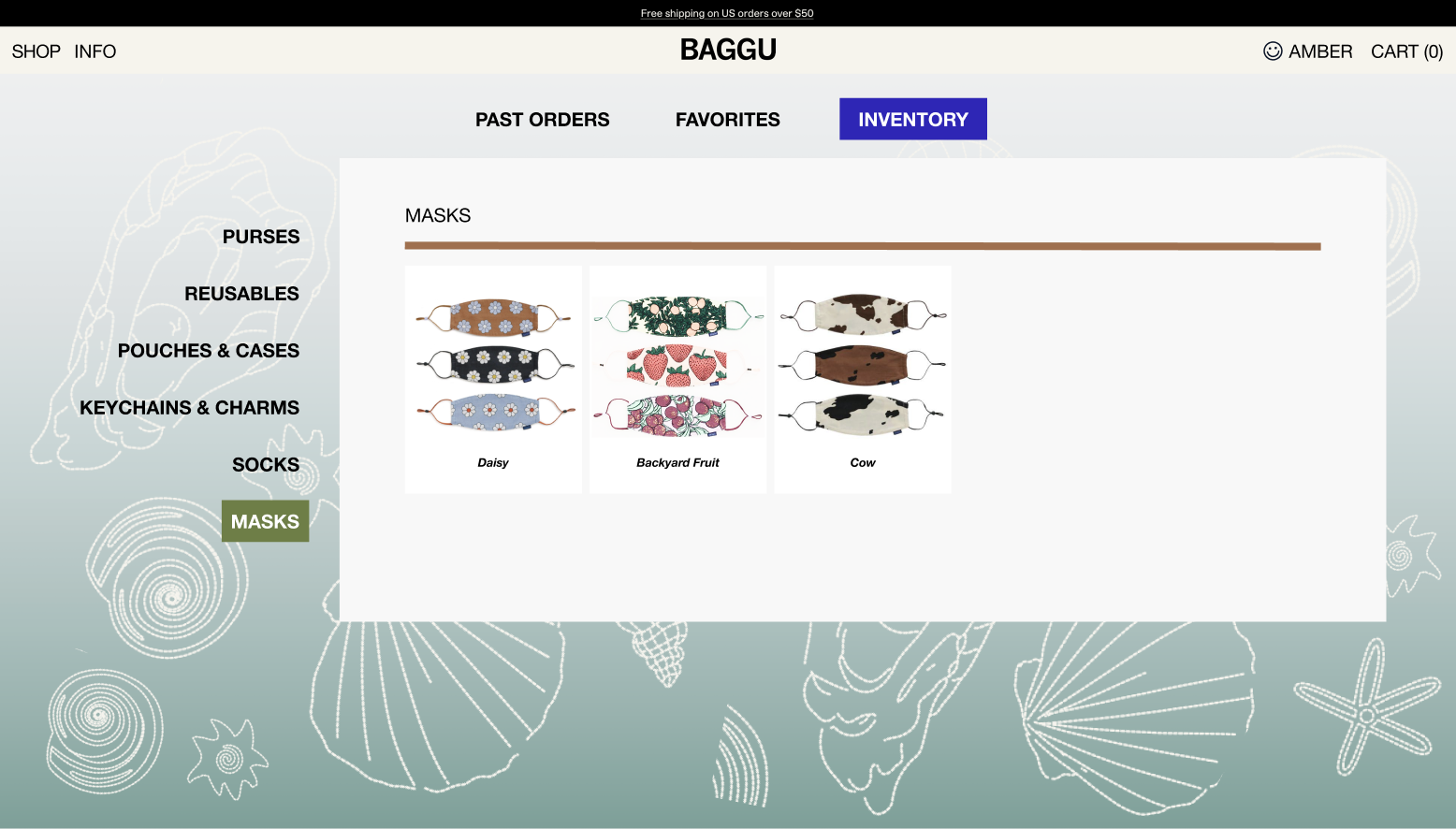
The idea was to turn your collection into something browsable and fun—almost like your own little Baggu museum (Bagguseum?). You can filter by category on the left, see everything neatly organized, and visually track your "sets". I thought that the inventory feature could even be a little sentimental, since Baggu prints are generally limited time releases!
What I Learned
This project made me appreciate how much a brand’s personality should extend into the “utility” parts of a website. Baggu has such a strong aesthetic and such a loyal community, so it only felt natural to bring more joy and clarity into the account experience.
If I were to keep going, I’d explore deeper reward integration, product recommendations, and even a robust secondhand market baked into the site itself. All of the former is of course, meant to keep the customer on the page and more immersed within Baggu, as the brand.
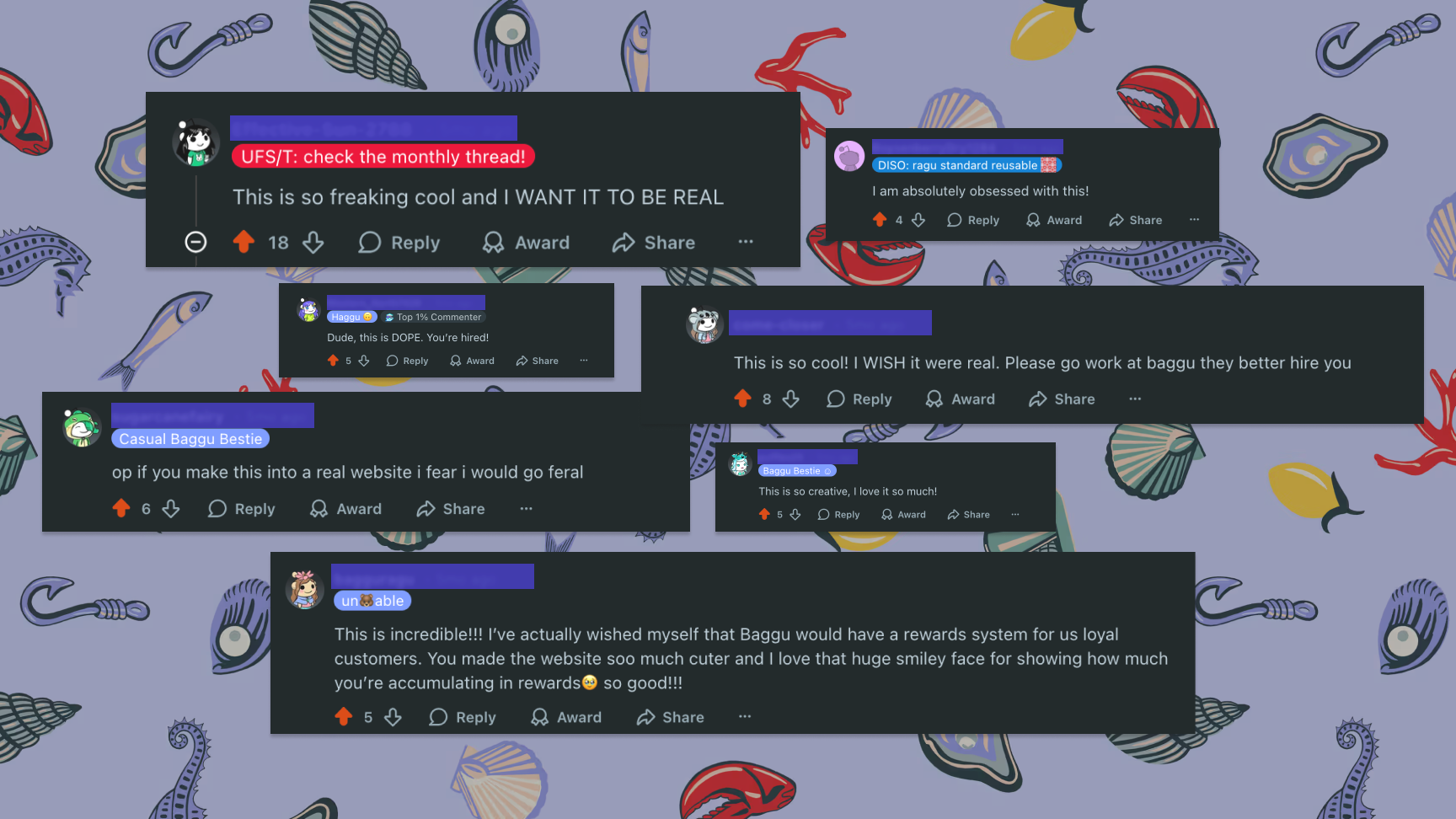
Baggu as a brand means a lot to me, and I would like to thank the community on reddit for their support. When I posted the above video, these are some of the responses I received.
