Designing for Degrees

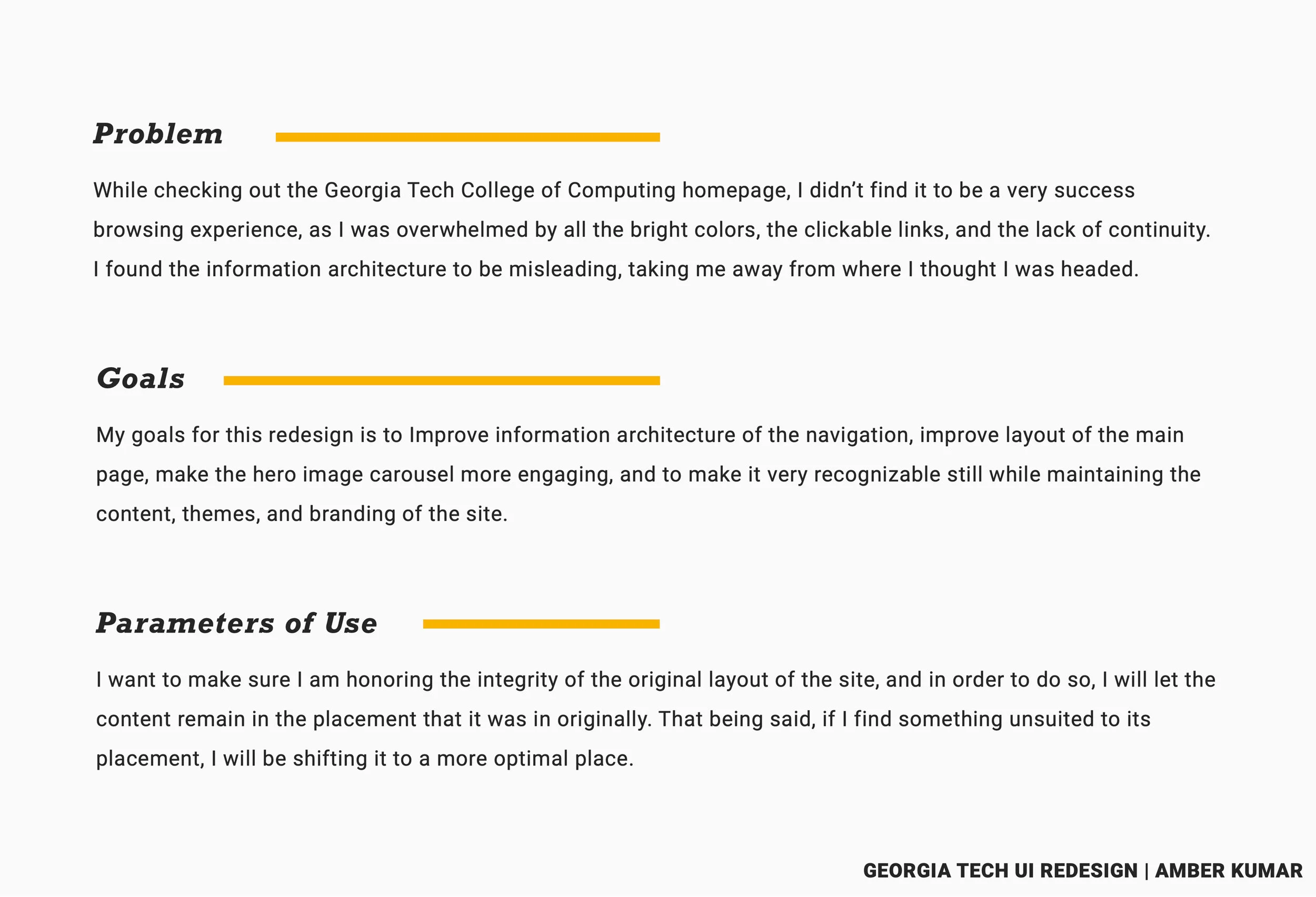
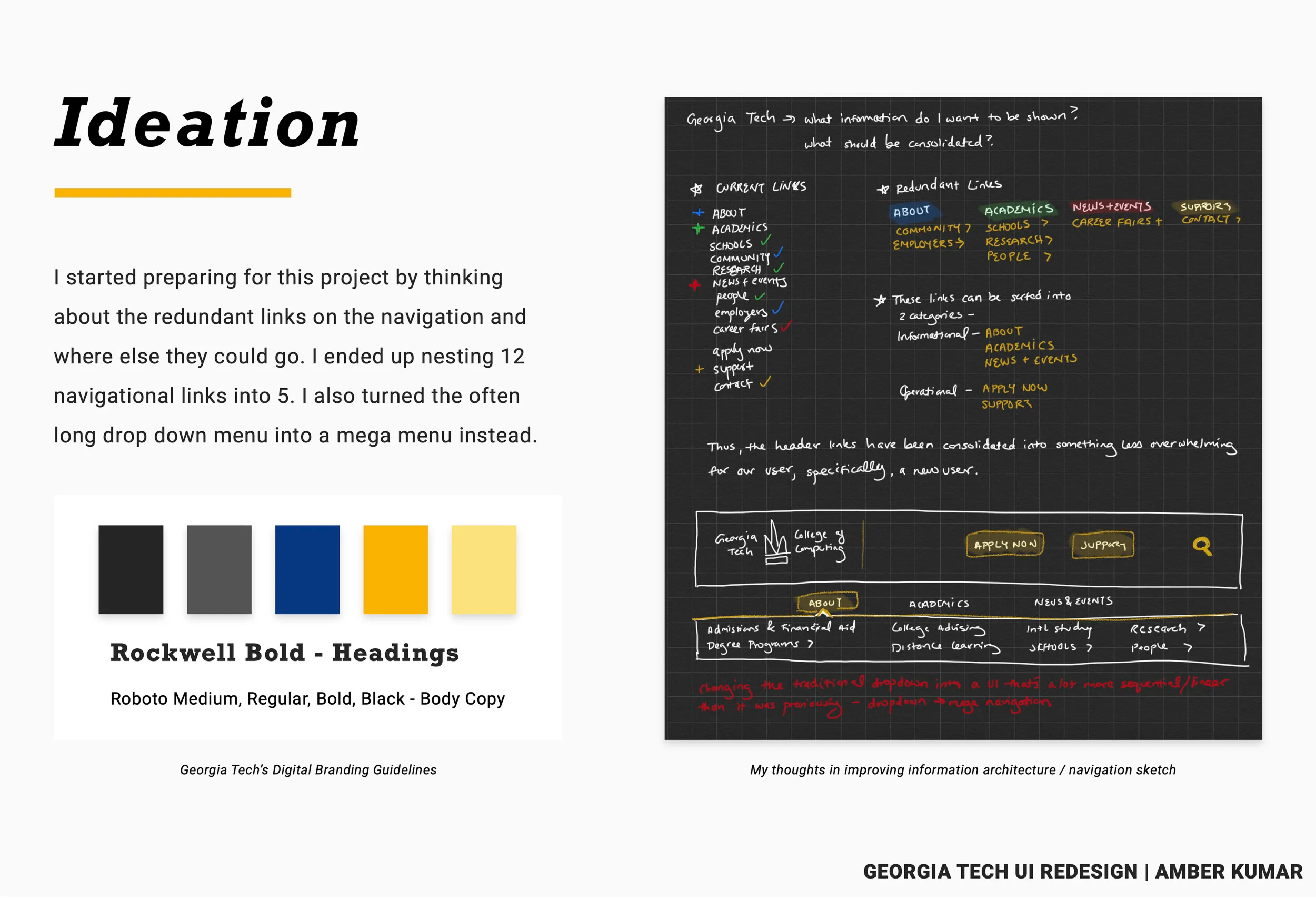
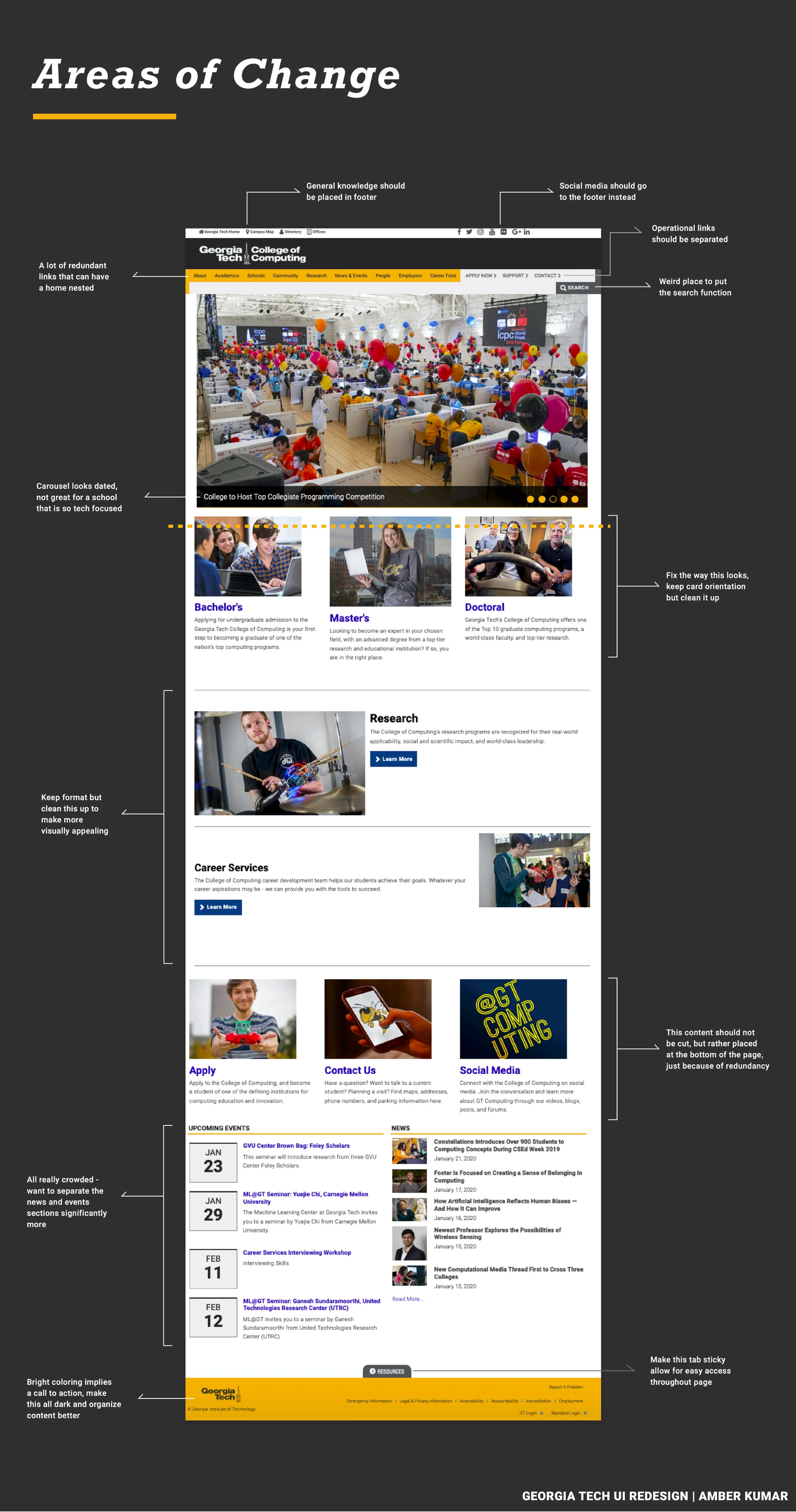
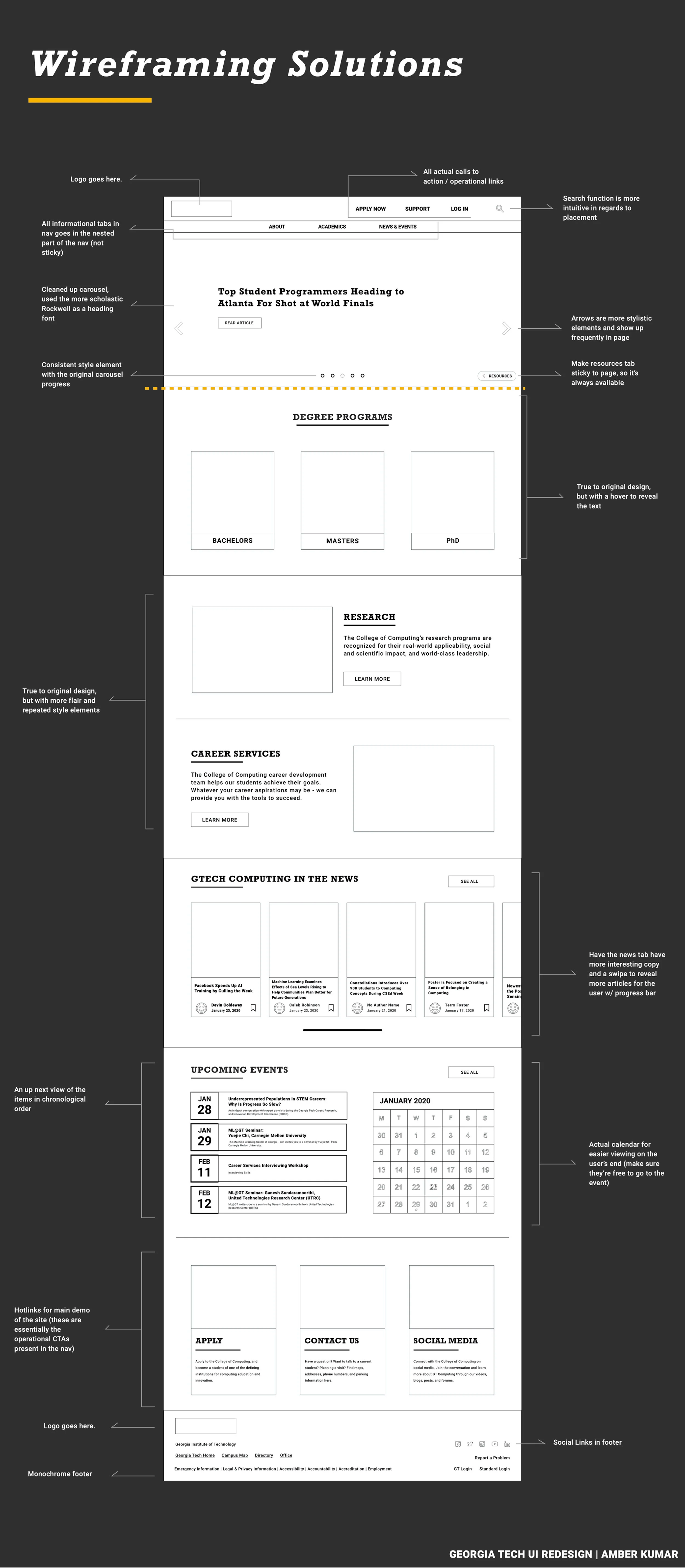
Redesigning Georgia Tech’s College of Computing homepage to best meet the needs outlined by both a digital and physical user.

Education UI/UX Web Design Redesign
Three-section layout titled Problem, Goals, and Parameters of Use describing confusing navigation, overwhelming colors, IA improvements, and optimized content placement for the Georgia Tech UI redesign. Page titled Ideation showing Georgia Tech brand colors and a navigation sketch with text about consolidating redundant links, converting dropdowns into a mega menu, and mapping old vs new IA. Annotated screenshot of the original Georgia Tech College of Computing homepage highlighting redundant links, cluttered layout, dated carousel, confusing search placement, and bright colors. Wireframe redesign of the Georgia Tech homepage with annotations on simplified navigation, reorganized carousel, clearer degree programs, improved research and career sections, better news layout, chronological events, and revised footer. Visual mockup of the redesigned Georgia Tech homepage showing updated hero carousel, reorganized degree tiles, refreshed research/career services, improved news layout, chronological events, and monochrome footer. Comparison of old and new Georgia Tech splash areas showing the old long dropdown and crowded navigation versus the new horizontal mega menu with cleaner hero carousel and CTA. Comparison of old degree programs section with short cards versus redesigned larger cards with stronger hierarchy, hover interactions, and contextual info. Side-by-side comparison of old and new Research and Career Services sections highlighting larger imagery, Rockwell headings, improved spacing, new hover states, and reorganized CTAs in the redesign. Comparison of old combined News and Events list versus redesigned layout separating Upcoming Events with a calendar view and News as horizontal tiles with author attribution. Before-and-after comparison of the Resources section showing a flat gray panel of links versus a sticky semi-transparent overlay with reorganized categories and digital resources emphasis. Text-only Future Iterations page describing potential work like exploring splash variations, enhancing brand unity, and considering further departures from the original layout.