The Bouqs: Preference Quiz
Context and Role
Couples often arrive on the wedding page with a feeling rather than a fixed idea. They might say romantic but still modern or colorful but not too bold. It is an emotional space and not one that pairs well with technical filters. While working on the wedding experience for The Bouqs, I explored how a guided quiz could help couples express their taste in a more natural way.
- Role: Product Designer. UX, UI and concept creation.
- Scope: Self initiated exploration during wedding category work.
- Platform: Responsive web.
Problem
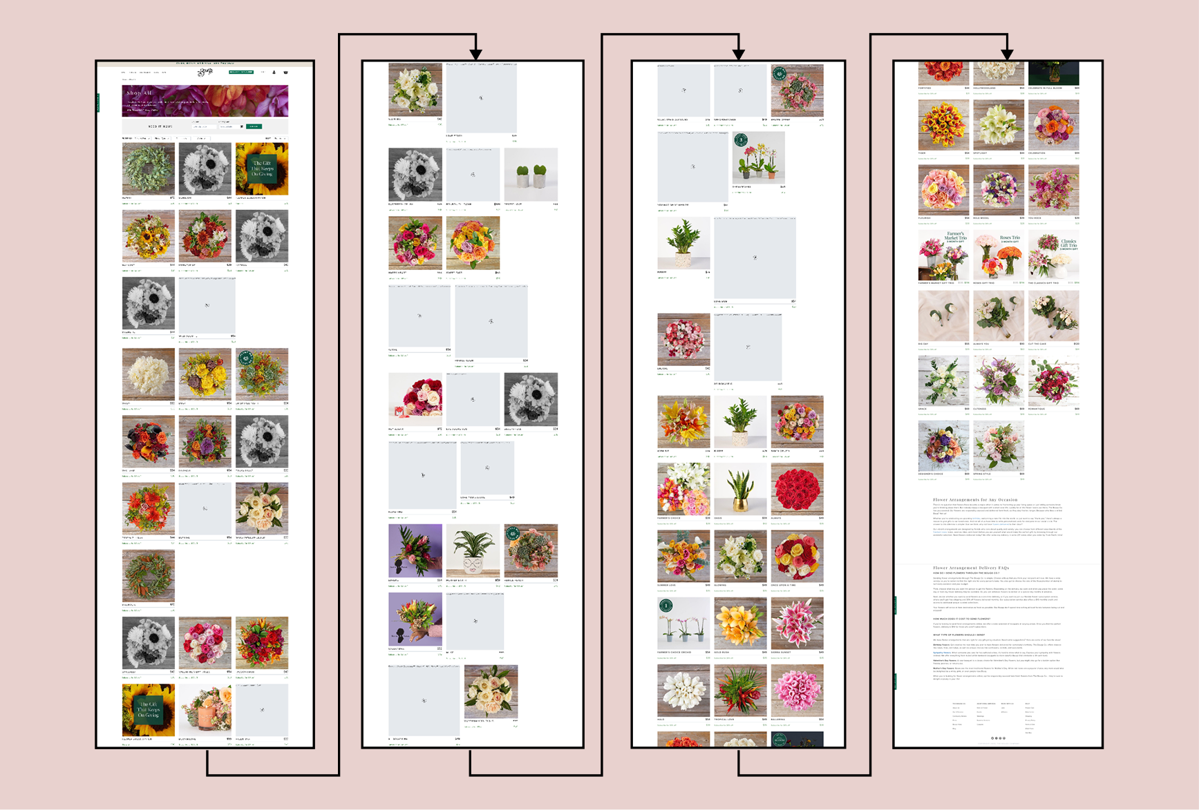
The wedding catalog is beautiful but also large, like on a standard desktop, it was around ~24,000px long. Browsing through product grids can feel overwhelming and it puts pressure on users to translate their ideas into filters that never quite fit. The existing approach asked them to make detailed decisions before they were ready which increased friction and drop off.
Solution Overview
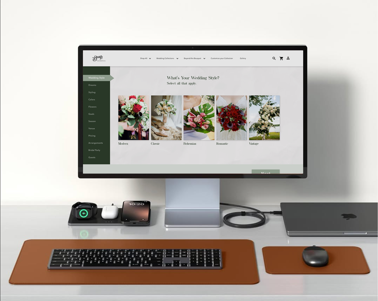
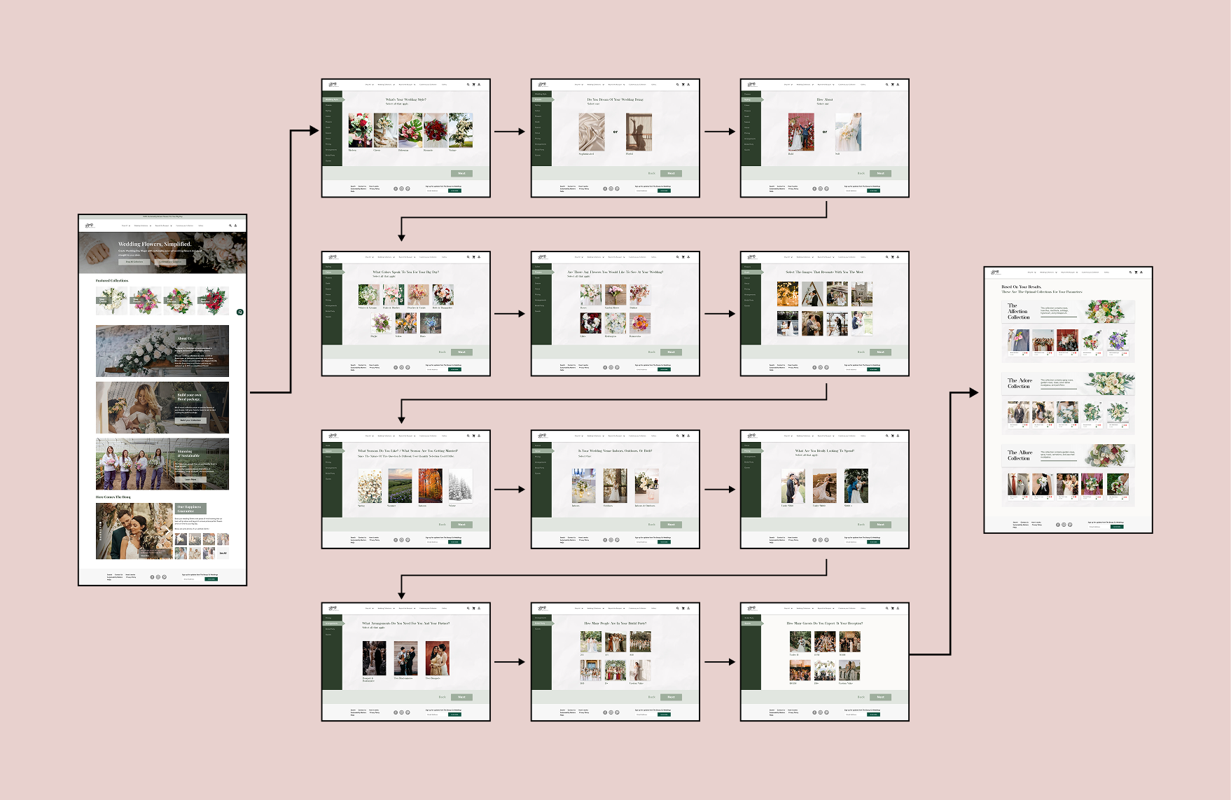
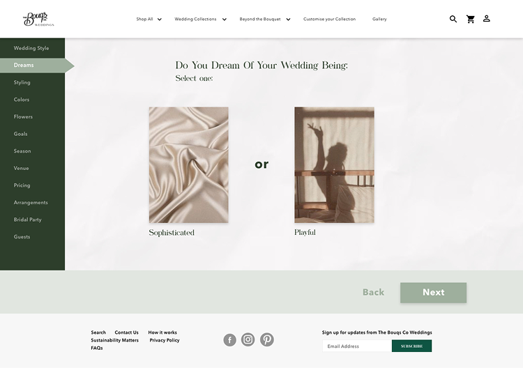
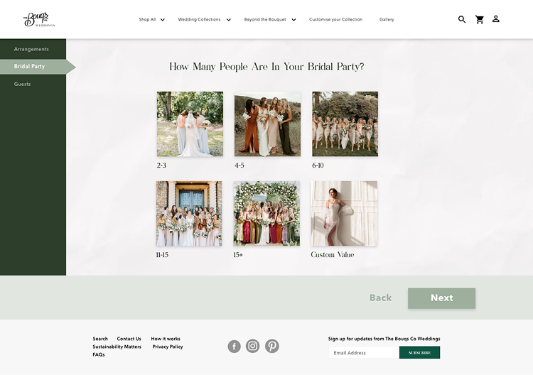
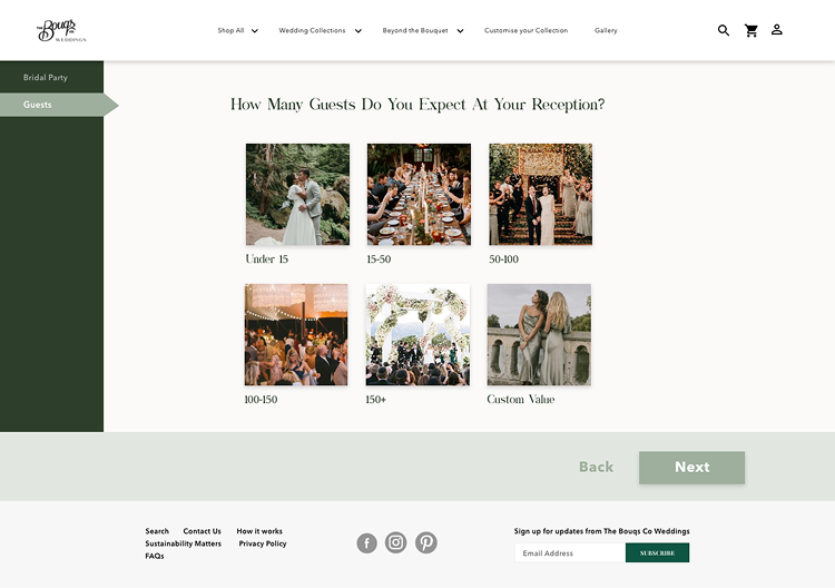
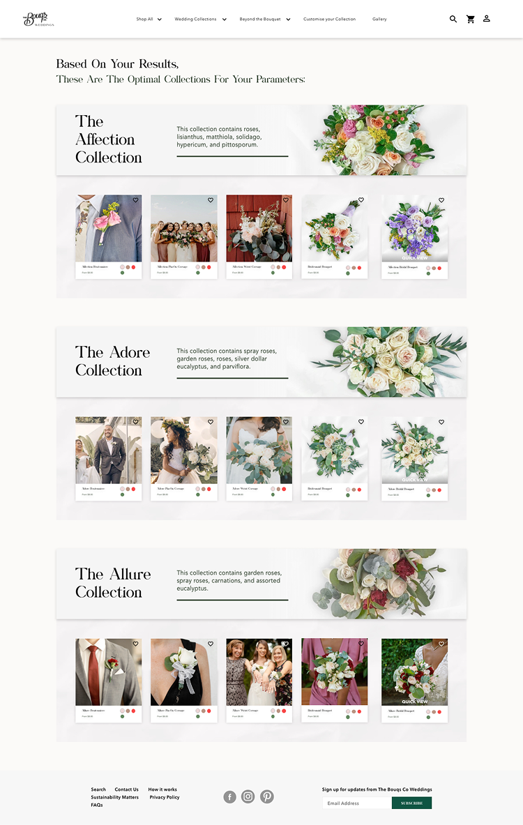
I designed a simple 10 step quiz that feels like building a moodboard. Each step is visual and quick which helps users make decisions based on intuition. Their answers map to structured attributes like style, palette, venue, season, preferred flowers, budget feel and event size. The final output is a set of curated wedding collections that already feel aligned to their taste.
What the Quiz Measures
Each step gathers one meaningful signal that shapes the final recommendations. The goal is to keep the experience light while still creating strong personalization.
-
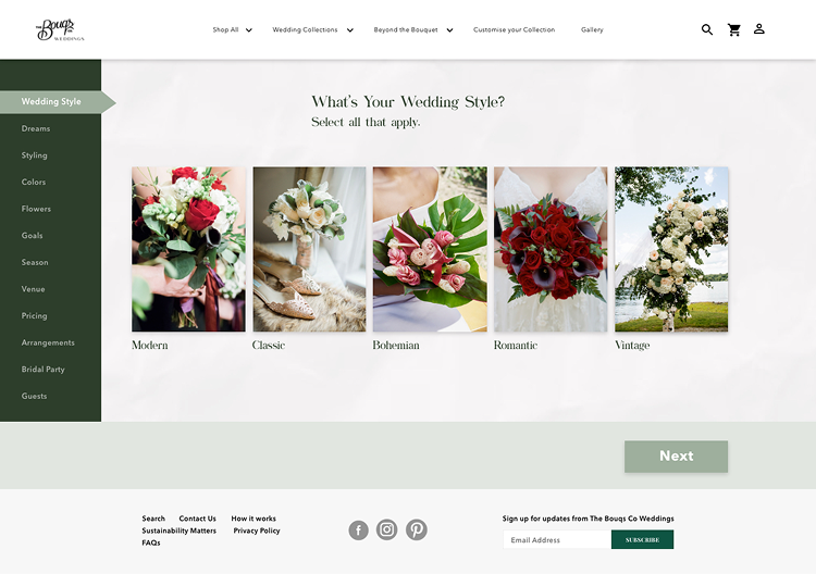
Wedding Style and Vibe
-
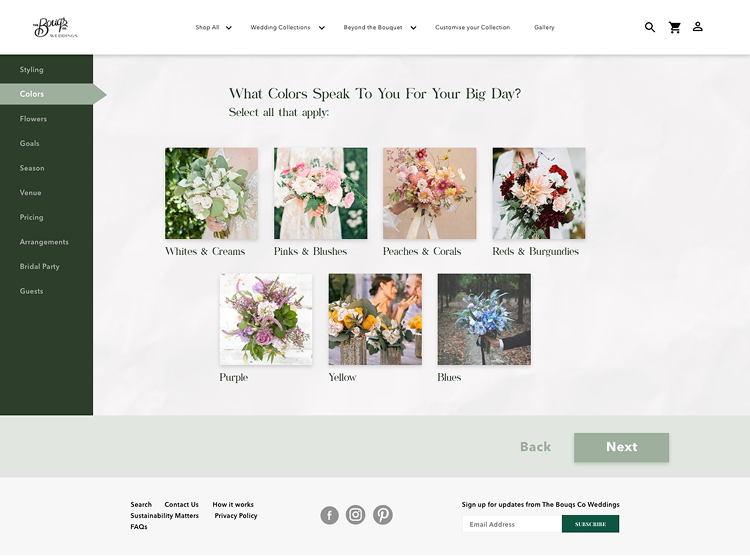
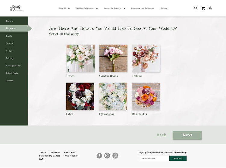
Color Palette and Favorite Flowers
-
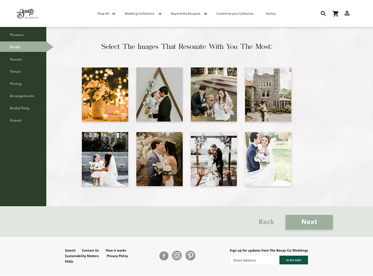
Inspiration and Decor
-
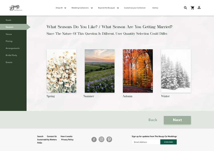
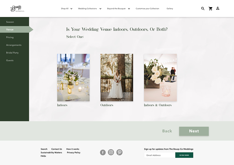
Venue and Season
-
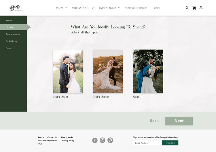
Budget Feel
-
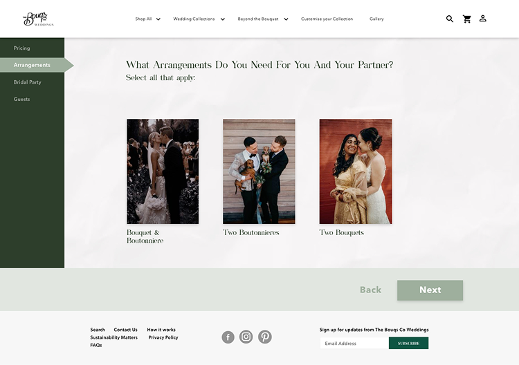
Arrangements, Bridal Party Size and Guest Count
Personalized Results
At the end of the quiz couples receive three curated wedding collections that match their style palette and event details. These collections scale automatically based on bridal party size and guest count which helps couples understand what they actually need.
UX and Accessibility Considerations
- Progress is always visible on the left so users understand where they are.
- Instructions like Select all that apply are always present and repeated where needed.
- Image cards are large and easy to tap on mobile.
- Each image includes descriptive alt text.
- Users can exit at any time and partial answers still improve recommendations.
Outcomes and Reflection
This project helped me explore how we are able to remove stress, even in a very marginal capacity, and improve how personal the experience feels. A small amount of guidance can reduce cognitive load and help couples feel more confident in their choices.
Ultimately, I found this to be a valuable exercise, as a business, we should always be focused on the user, and ultimately, we are able to support customers through a more intuitive and emotionally aligned journey, especially during such a stressful time.