The Bouqs – E-commerce Site Redesign
Happy Path Journey
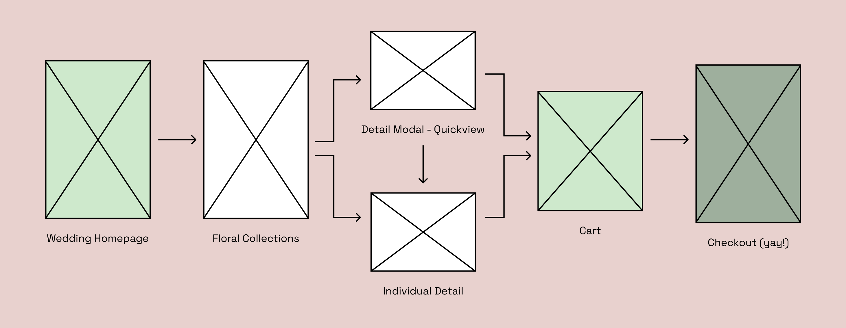
I mapped the ideal wedding shopping journey to understand where structure was needed and where inspiration should play a stronger role. This path guided layout decisions throughout the redesign and ensured each page supported a clear and confident flow toward checkout.
Both versions match this UX mapping.
Context & Role
I was asked to explore a full-site refresh for The Bouqs wedding category. The existing experience felt busy and dated, with inconsistent hierarchy and heavy use of mixed photography styles. My work covered UX, visual design, and interaction design from early exploration through high fidelity concepts.
Problem & Goals
Shoppers loved the floral photography but often struggled to scan large collections, compare options, or understand what they were buying for meaningful events like weddings and parties. The site needed stronger structure, clearer shopping paths, and more accessible design choices.
- Improve page hierarchy to help shoppers find relevant collections quickly.
- Make product cards and detail pages easier to compare at a glance.
- Create a calmer, more wedding-friendly visual language.
- Raise accessibility through contrast, type scale, and layout consistency.
Homepage – Original to V1 and V2
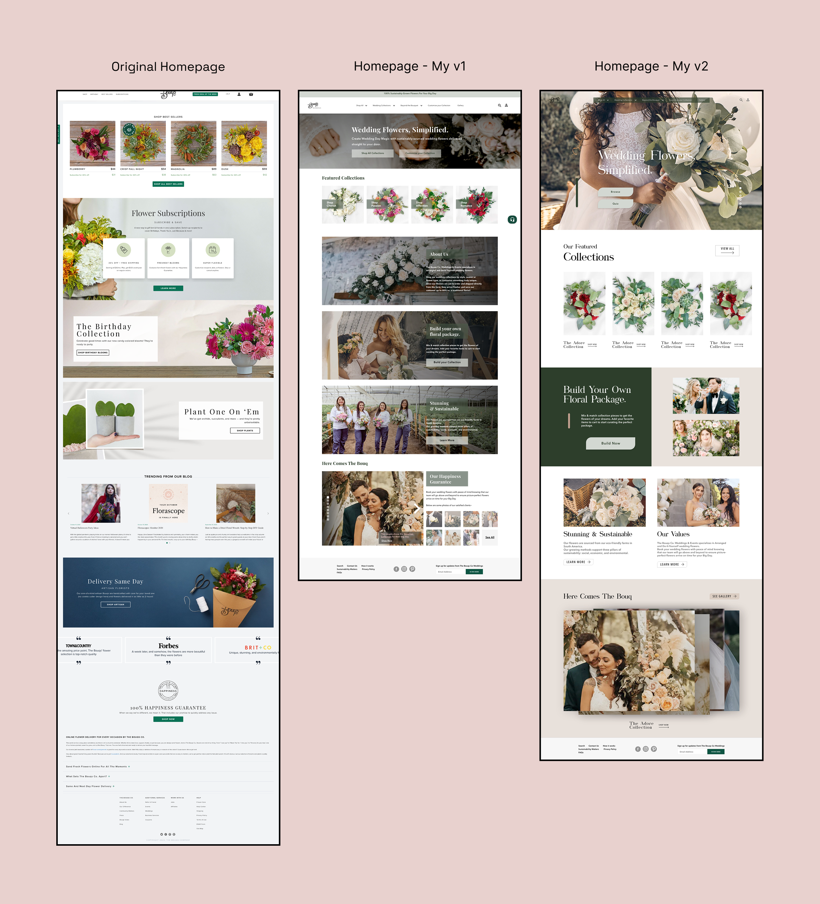
The original homepage felt cluttered, with competing modules and promotional blocks that made it hard to understand the wedding offering. V1 introduced a calmer editorial layout with featured collections and storytelling through photography. V2 pushed this further, using a more immersive hero, clearer actions, and structured sections that highlight collections, values, and inspiration.
Collection Page – Original to V1 and V2

The original collection page was extremely long and hard to scan, with inconsistent image ratios and very little hierarchy. V1 focused on adding structure, spacing, and more consistent card design. V2 reorganized the experience around curated collections with brief descriptions and a clean sidebar filter. The result feels calmer and more purposeful, which supports decision making for weddings.
Detail Page – Original to V1 and V2
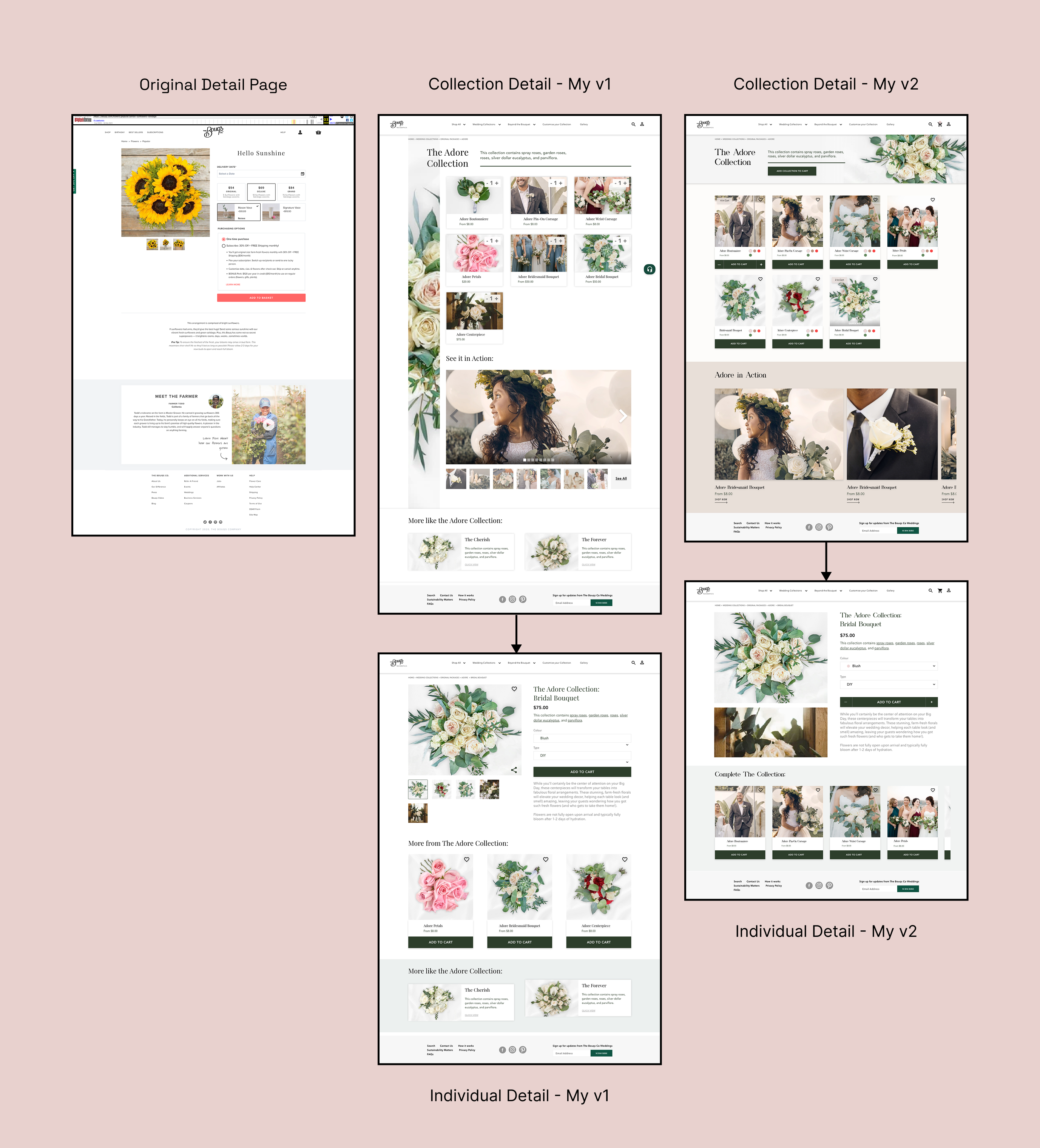
The original detail page hid important information below the fold and made the main photo feel secondary. V1 reorganized the structure so the hero image, description, and key actions live together at the top. V2 refined the layout further with an immersive photo, simplified info hierarchy, and lifestyle imagery that helps shoppers picture the arrangements in real weddings.
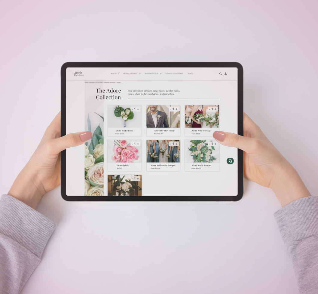
Quickview – V1 and V2
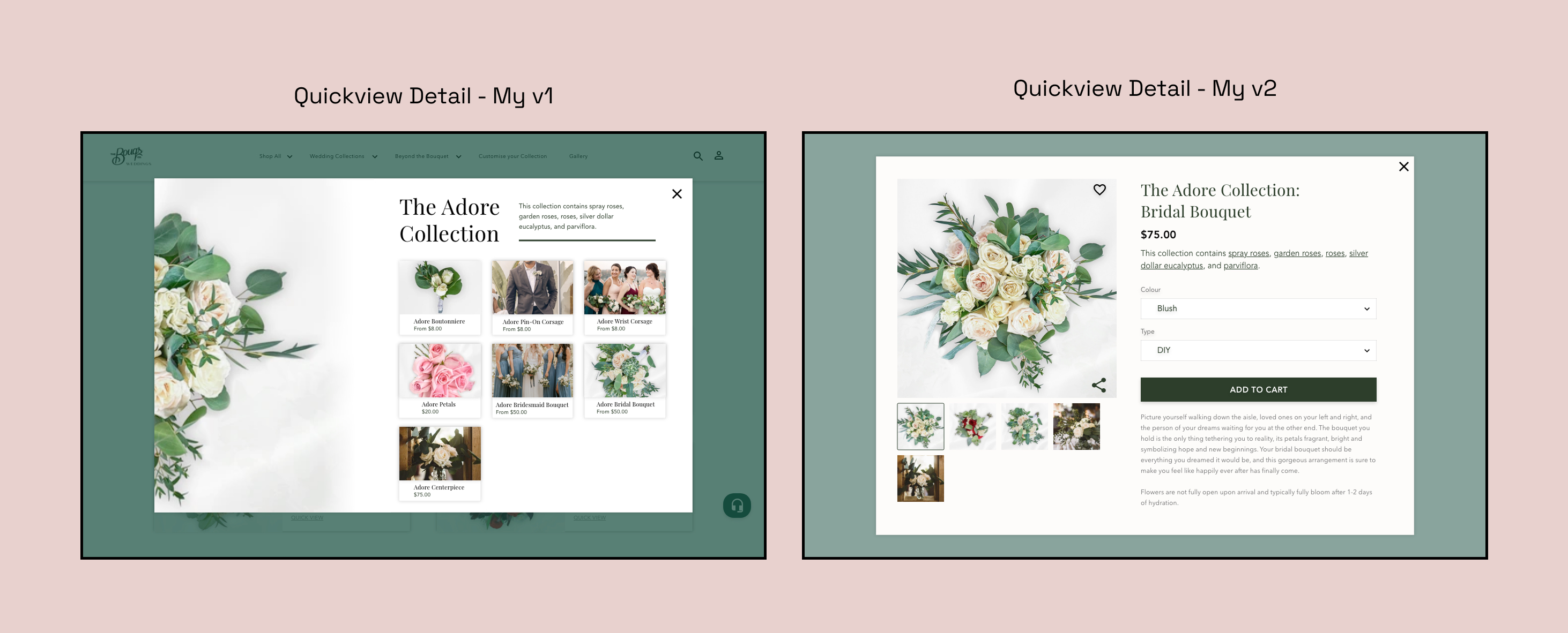
The first quickview concept displayed the whole collection but lacked clarity around what the shopper could purchase. The updated version mirrors the simplicity of the detail page, with a clear hero image, concise options, and a straightforward add to cart flow.
Key UX & Visual Changes from V1 to V2
Between the first and second concept, I systematically refined the experience to be more accessible, modern, and task-focused:
- Stronger hierarchy: Headings, subheads, and cards now feel distinct, making scan paths more predictable.
- Purposeful color: Richer greens highlight CTAs and section headers with better contrast.
- Improved card design: Consistent imagery, precise typography, and more breathing room reduce noise.
- Accessibility upgrades: Raised contrast, increased base font sizes, and simplified overlays on photography.
- Clear CTAs: Prominent “Shop the Collection” and “Build Your Own Bouquet” buttons guide the next step.
- Journey separation: Inspiration content is distinct from shopping tasks to keep the flow simple but delightful.