XDefiant: Ability Select Restriction
The Team & My Role
I was the UX designer on this feature, partnering with:
- The lead UI artist, to translate the UX into a shippable, branded interface
- Gameplay designers, to align restrictions with balance and ranked rules
- A pro gamer consultant, who stress-tested the flow from a competitive lens
- UI Tech Artists, to confirm we could support the necessary real-time states
Players & Their Needs
The primary players here are ranked and competitive players. They need:
- At-a-glance clarity on what their team is bringing into a match
- Fast decision making under time pressure, on controller and M+K
- Feedback when something is restricted, and why
- Fairness: no one wants to feel “locked out” without understanding the rules
What We Started With
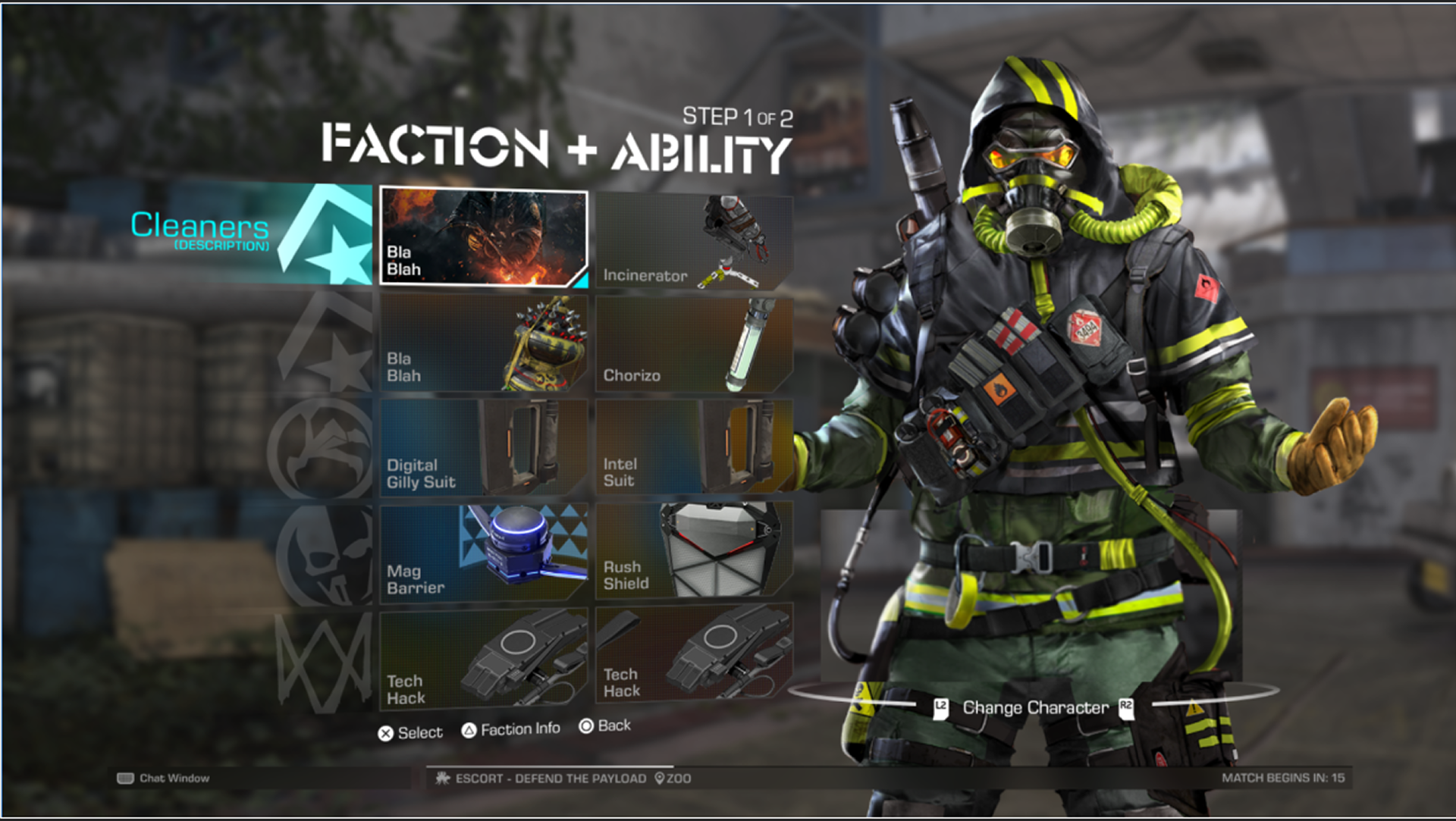
Before this work, our character selection screen already combined Faction + Ability into a single step. It did its job, but it treated abilities almost like a checklist: technically available, but not surfaced as a strategic choice.
Stakeholder Ask: Increase Character Presence
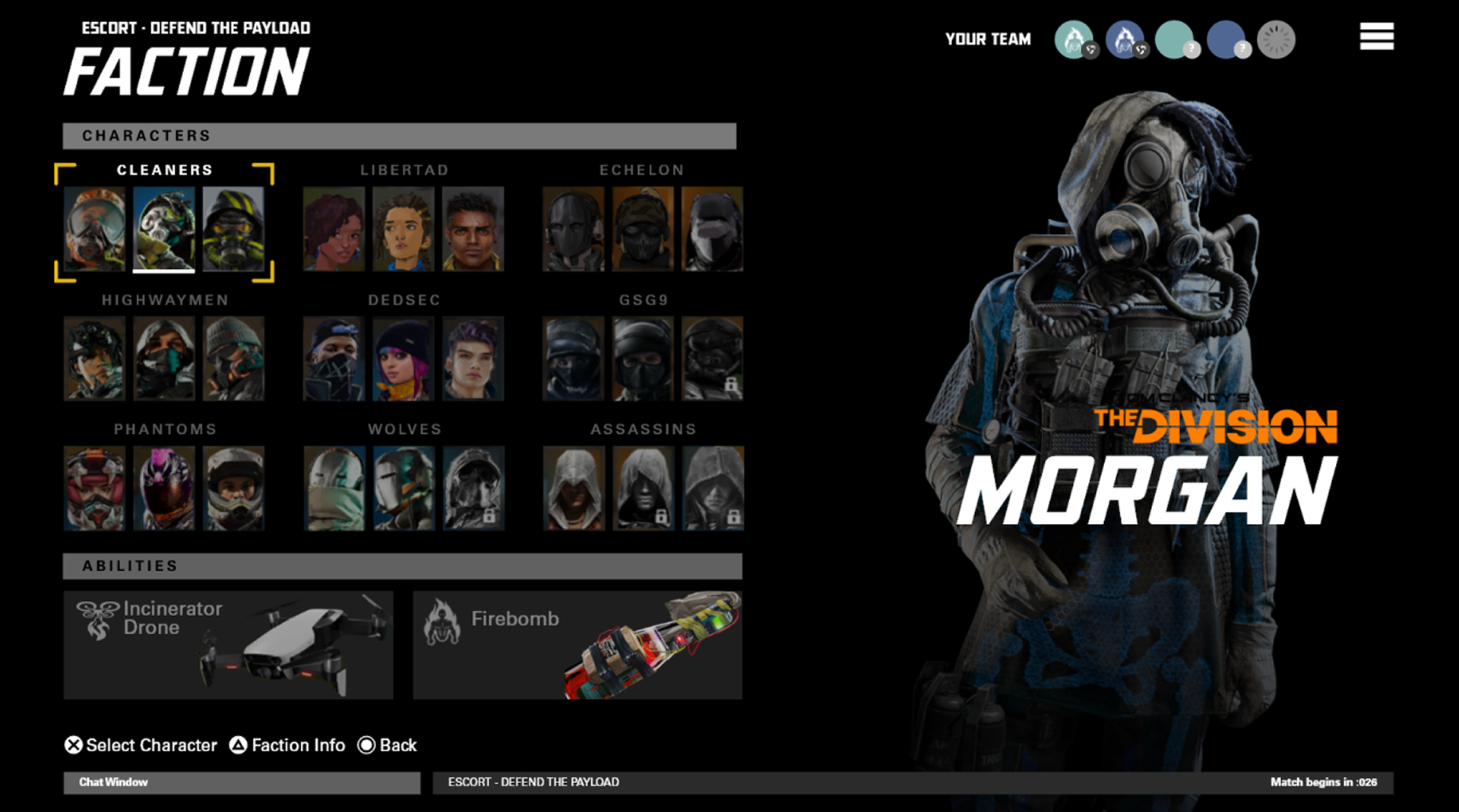
Our initial ability-selection UI was built for clarity first — tight grids, fast scanning, low cognitive load. But during stakeholder reviews, leadership wanted more character visibility to better support long-term cosmetic and IP identity strategies.
Evolution of the Layout
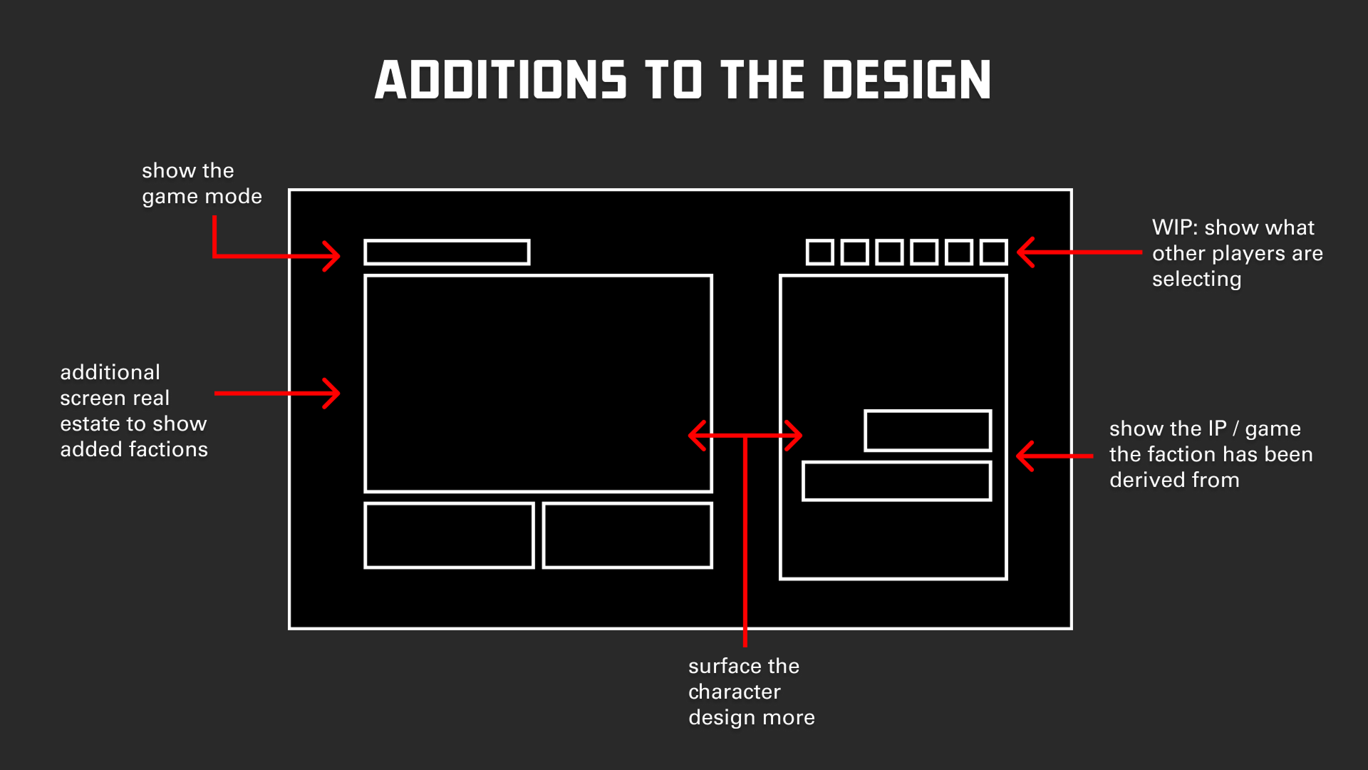
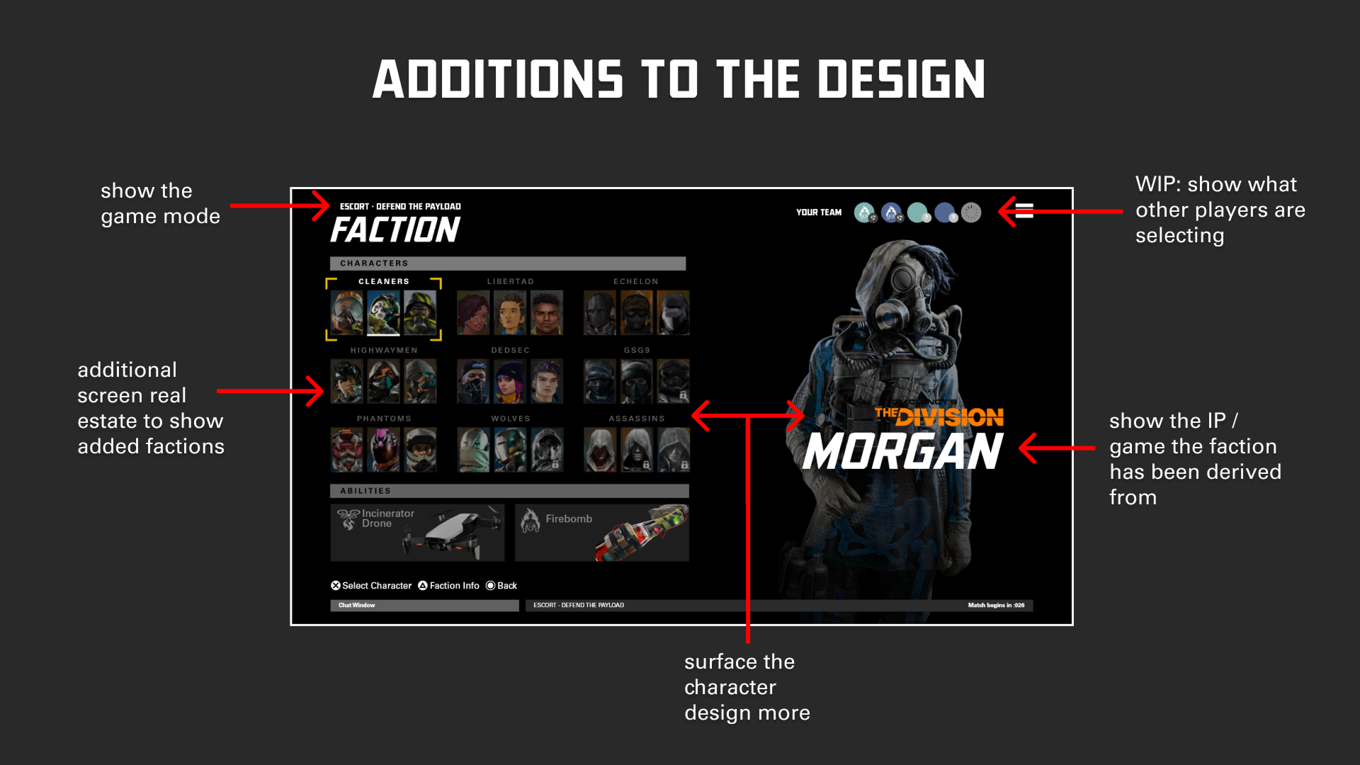
Below, you can scrub between the annotated UX callouts and the updated stakeholder direction.
Ability Select — Annotated UX → Stakeholder Visual Direction
UX Design: Reframing Faction + Ability as a System
From a UX perspective, I treated this screen as a team composition tool, not just a gallery. The core principles:
- Hierarchy: Factions and characters at the top, abilities anchored below.
- Spatial mapping: Abilities are visually tied to the chosen faction.
- Readability at speed: Typography and groupings that hold up in the last 5 seconds of a countdown.
UI Design: Shipping the New Faction Select
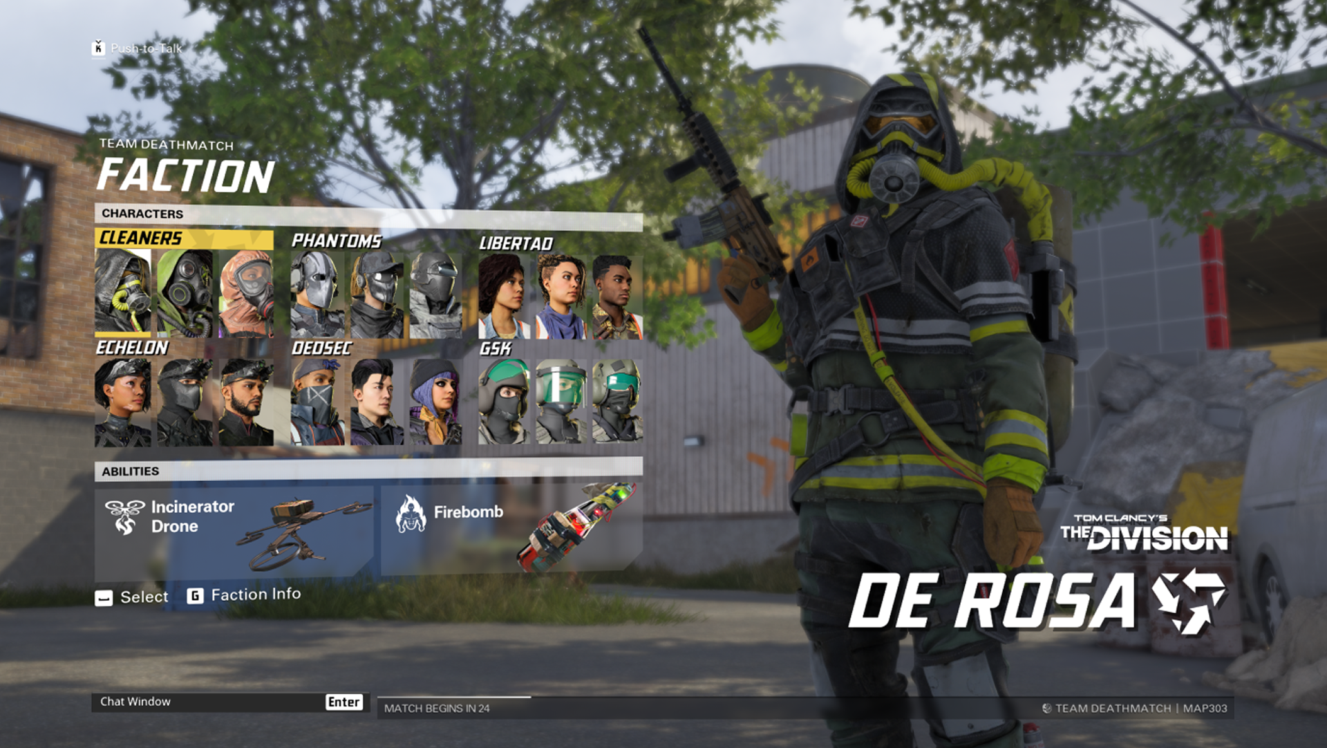
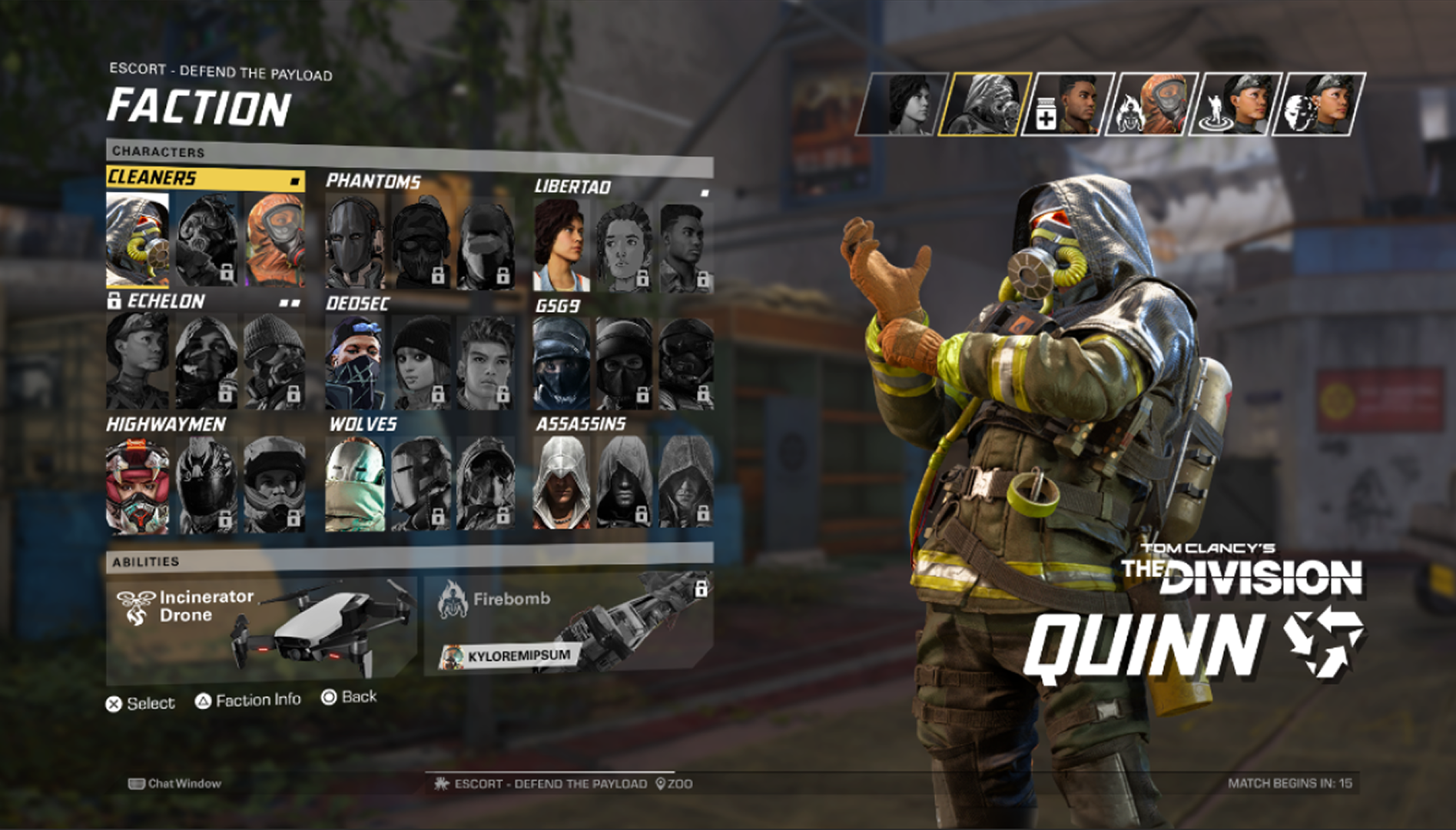
Once the UX was stable, the UI team pushed it into a branded, shippable treatment: bold faction typography, clear rarity and lock states, and full-bleed character art. My role here was to protect the UX intent: ensuring that visual flourishes never compromised contrast, focus states, or input affordances.
Playtest Feedback: “Teams Don’t Feel Balanced”
After this version shipped internally, we ran an internal playtest and a pro gamer review. The consistent theme:
- Teams technically could stack strong abilities, and when they did, the opposing team felt disadvantaged from the lobby onward.
- Players had low visibility into what their teammates had already chosen. It was easy to double-pick the same powerful ability without realizing it.
In response, design introduced Ability Select Restriction for ranked: every ability can only appear once per team. UX now needed to make that rule obvious, fair, and fast to interpret.
UX for Ability Select Restriction
I approached Ability Select Restriction as a visibility and feedback problem: players should understand, at a glance:
- Who has locked what
- What’s still open to choose
- Why something is blocked
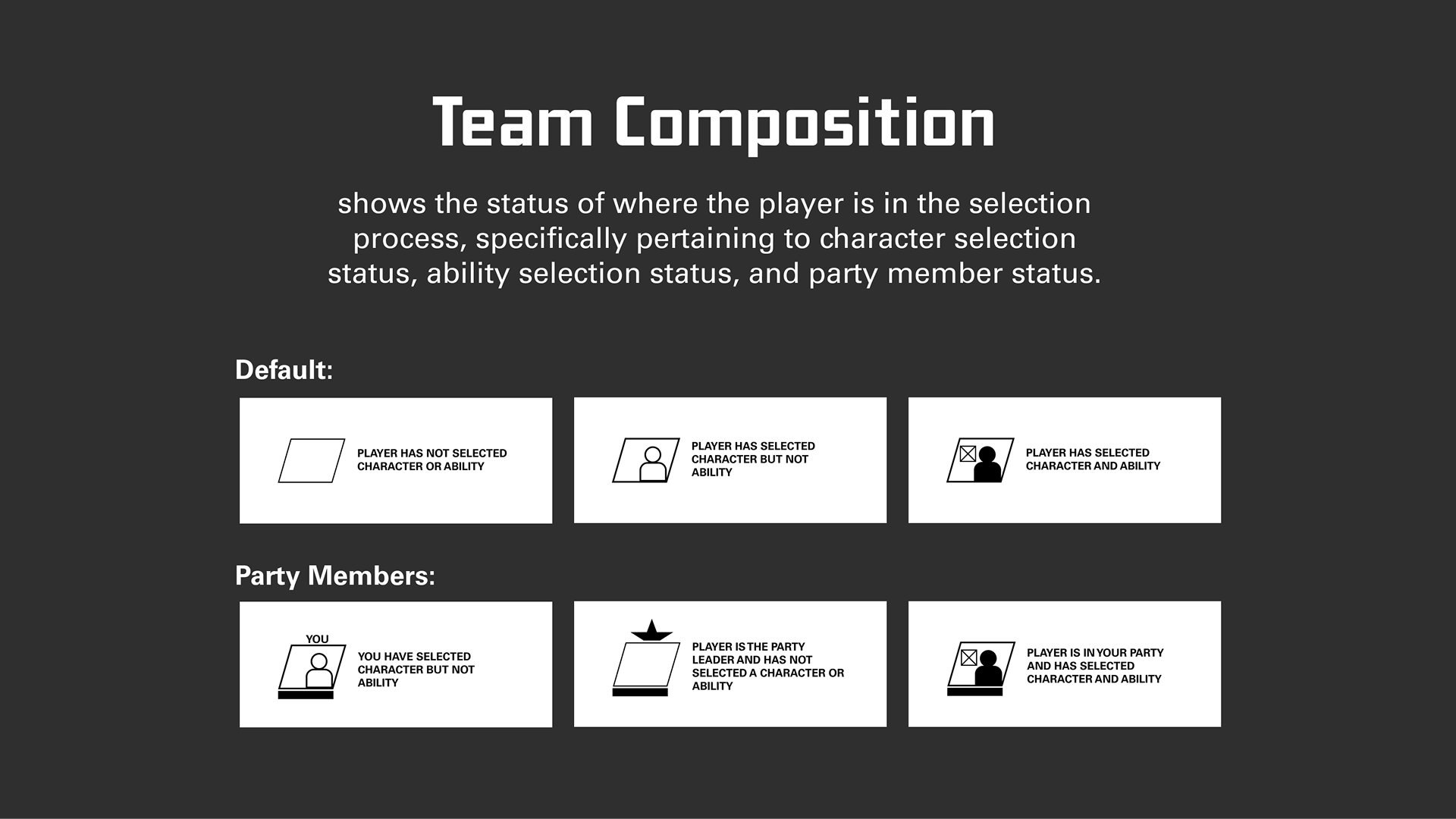
Team Composition as a Live Status Bar
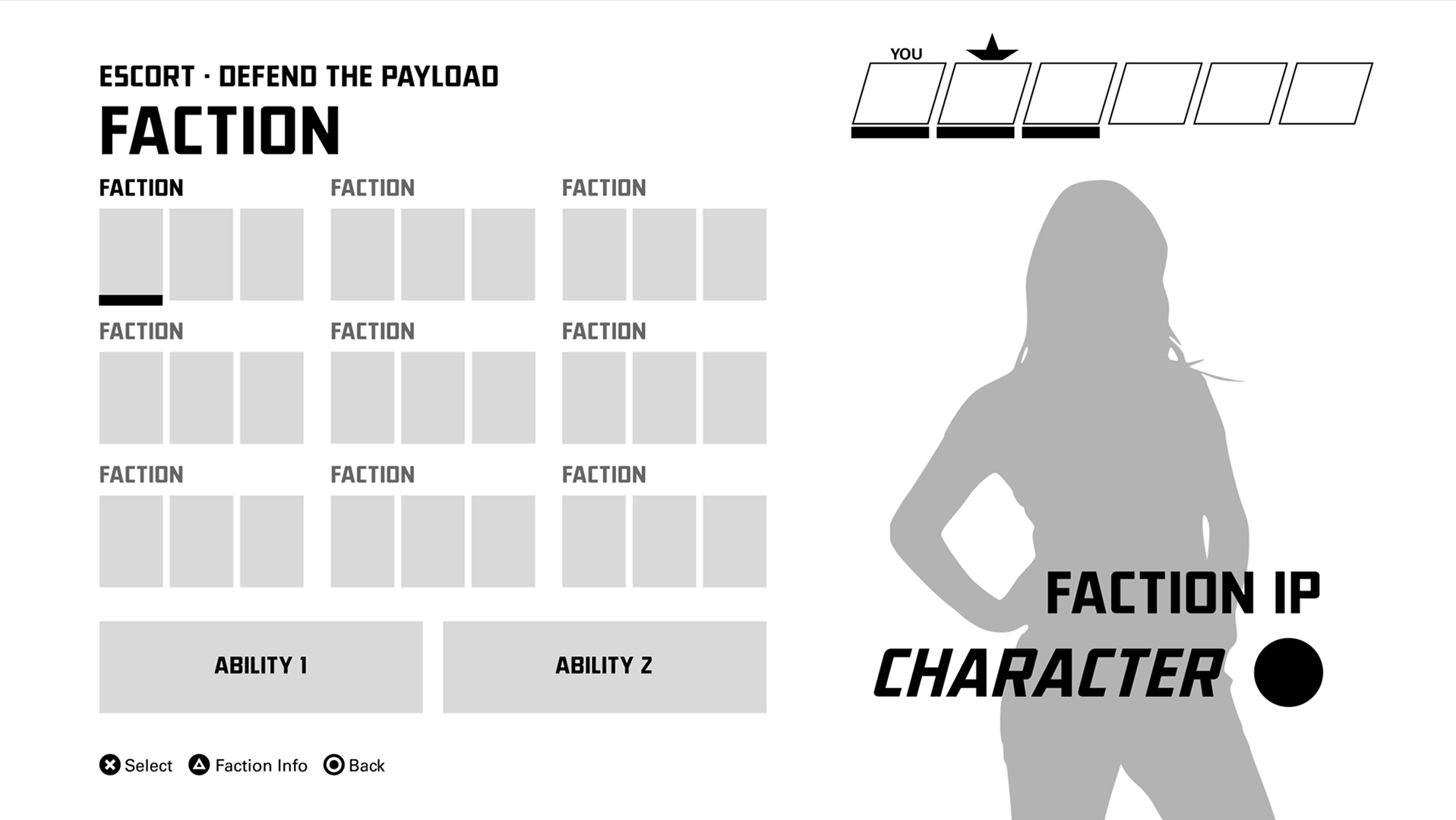
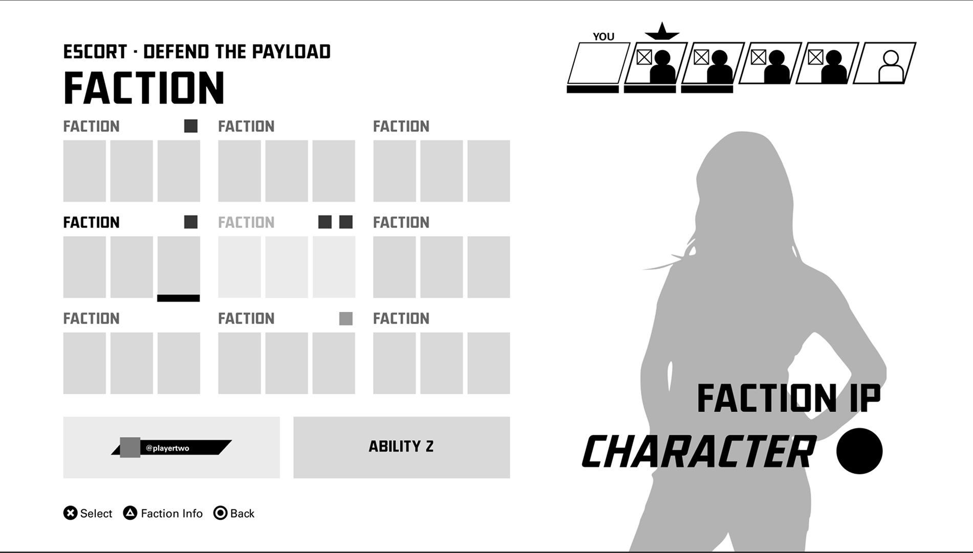
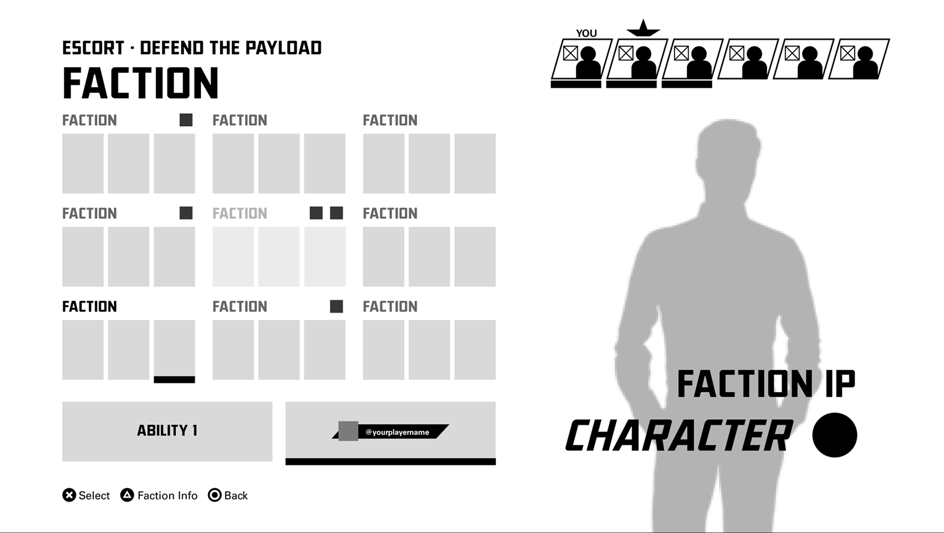
First, I created a Team Composition system — a compact but expressive representation of each player’s state (no pick, character only, character+ability) using consistent iconography and labels.
Faction Groups + Ability Buttons
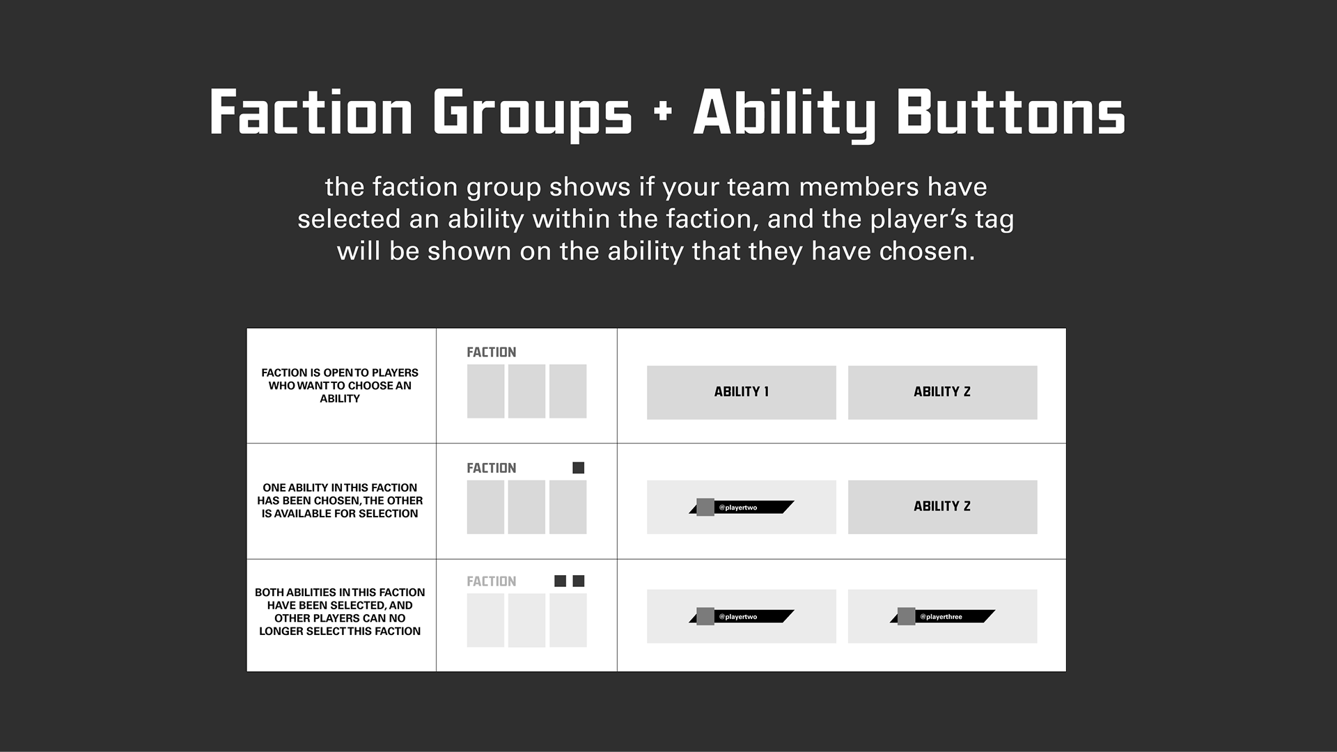
To keep cognitive load low, I decomposed the restriction state into three simple conditions per faction:
- Faction open: no abilities taken yet
- One ability taken: one slot open, one tagged with a teammate’s name
- Both taken: faction closed for new picks
Progression Through States
I then mapped how the screen should evolve as teammates lock in. The focus was on: progressive disclosure (only reveal relevant warnings) and predictable patterns (same visual language for locks everywhere).
UI for Ability Select Restriction
The final UI treatment integrates restriction states into the existing faction-select layout without introducing new visual systems. We reused:
- Lock iconography that players already knew from character unlocks
- High-contrast tags to show which teammate owns an ability
- Consistent positions for team status at the top of the screen
Video: Team Comp + Ability Select in Action
This walkthrough shows the updated team composition bar, ability lockouts, and how the restriction behaves as teammates lock in their picks.
Things We Wanted to Add (But Couldn’t Ship)
Team Composition shipped, but the game was shut down around the release of Season 3, before we could finish several adjacent features. These stayed at UX or WIP UI:
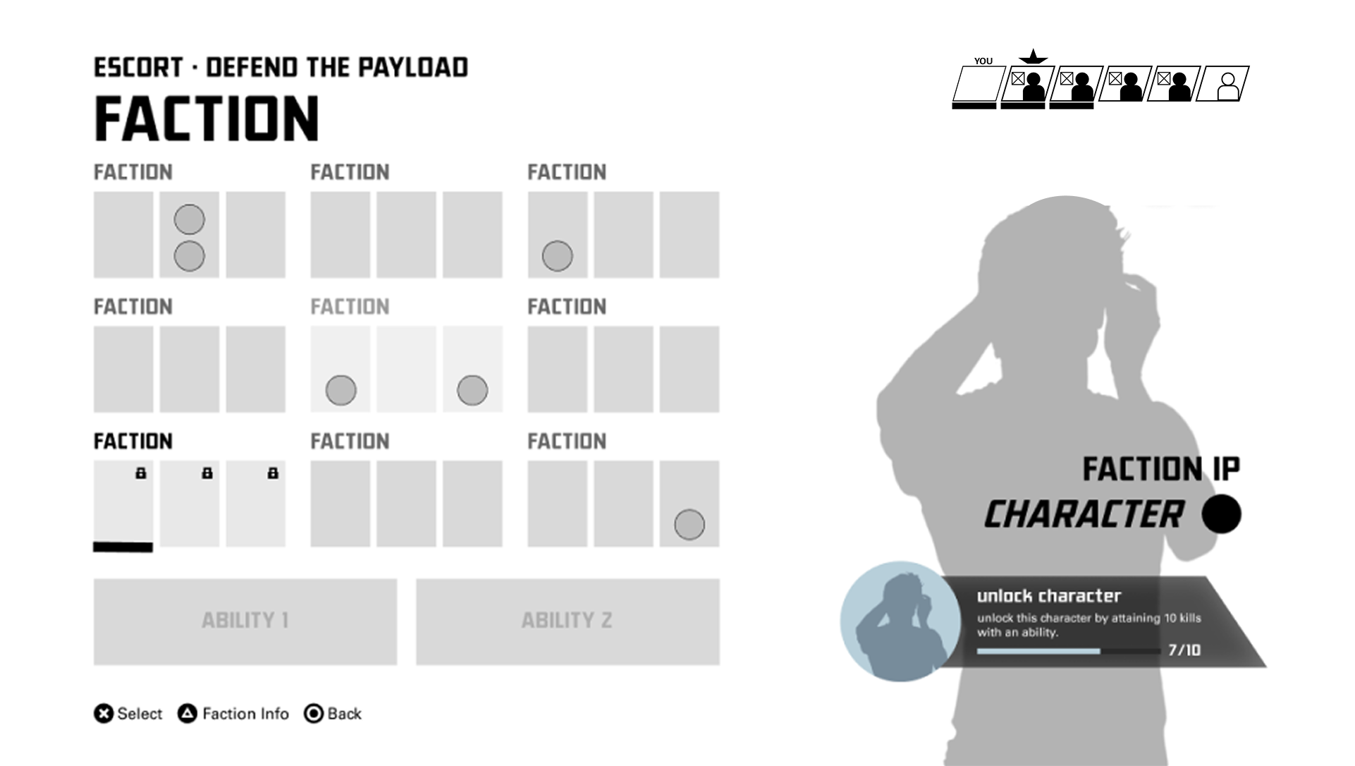
Challenge Widget
A small widget that surfaced ability-related challenges on the same screen, so players didn’t need to context-switch to another menu to decide what to bring into a match.
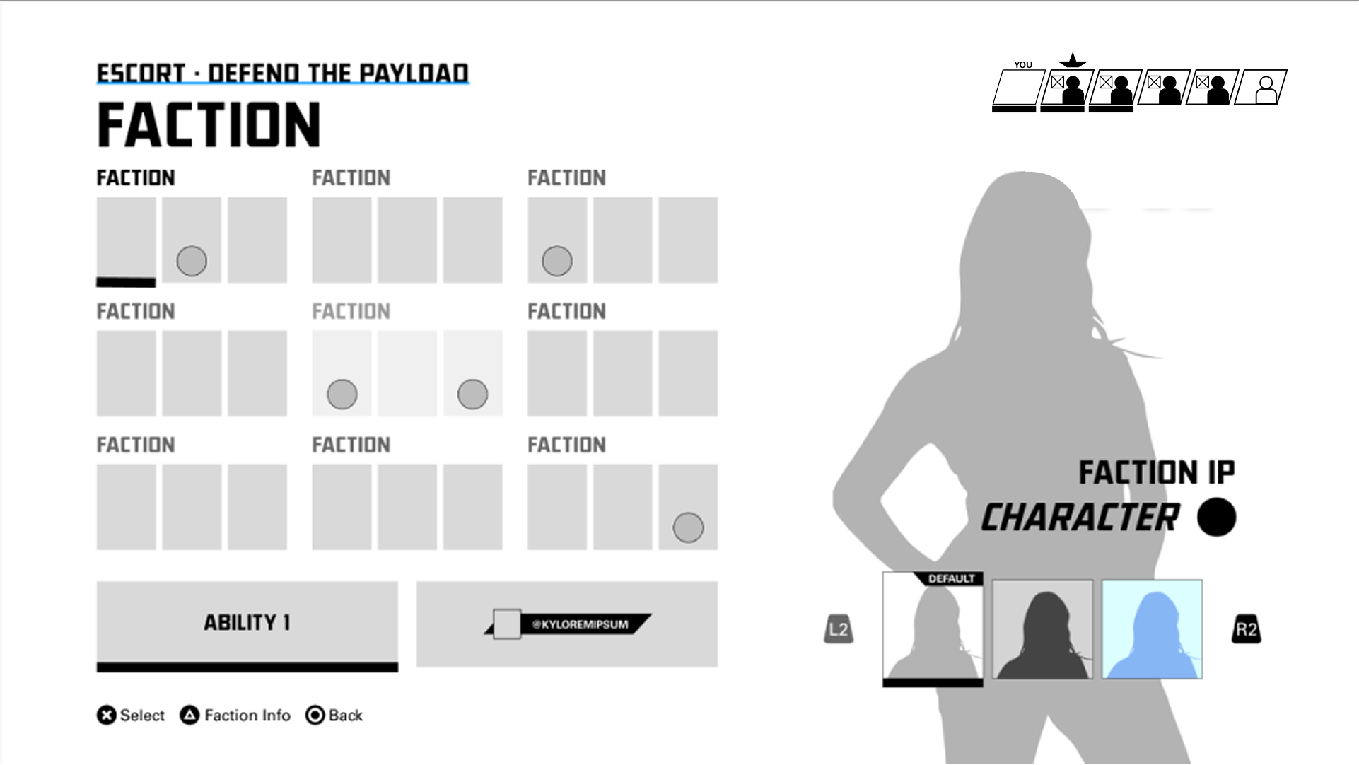
Skin Selection in the Same Flow
To support monetization goals without harming usability, I explored a lightweight skin selector attached to the character column. The idea was to keep the primary decision (faction + ability) in focus, while making skins a secondary, optional action.
Before / After at a Glance


Impact & What I’d Do Differently
Impact
Even without full rollout of the restriction UI, this work:
- Gave tech artists and our UI lead a clear framework for how restriction rules would surface in UI
- Created a shared language (icons, states, team comps) across UX, UI, and gameplay design
- Helped clarify future-facing decisions around skins, challenges, and ranked-only behavior
What I’d Do Differently
- Push harder on controller efficiency. I proposed grouping abilities behind factions to reduce the number of “clicks” required to move across the row, especially on controller. In practice this would have turned a long lateral movement into a two-step interaction (select faction, then select from that faction’s ability subgroup), which is more in line with Fitts’s Law and supports faster target acquisition. Stakeholders ultimately preferred the flatter layout; in hindsight I’d bring stronger prototypes and data to that conversation.
- Move usability testing earlier for the restriction states, so we could validate language and iconography with non-competitive players as well.
- Explore a lightweight “fairness preview” — some way of indicating team archetypes (e.g., double support, heavy disruption) to help close the loop on the “does this feel balanced?” question.