XDefiant: Daily Login UX
Problem & Constraints
- Clearly communicates what players get today and in the future
- Encourages streaks and long-term return without feeling confusing or overwhelming
- Scales to different reward campaigns (weekly / monthly)
- Hands off cleanly to UI art for final visual polish
MTX wanted a system that could support both short “bursts” of rewards and longer campaigns, while reinforcing return habits through clear streaks and milestone rewards.
The main UX challenges:
- Represent many days of rewards without clutter
- Highlight “today” and the next big milestone
- Make it obvious which rewards are claimed vs. locked
- Keep the layout flexible for localization and art direction
Exploration 1 — Weekly Track Concept
The first prototype framed the daily login as a weekly track. Each day appeared as a tile in a short horizontal sequence, making it easy to grasp the full week at a glance.
- Short horizon: Only shows the current week to keep cognitive load low.
- Strong focus on the present: “Today” is highlighted with a prominent tile and reward callout.
- Completion feedback: Past days are marked as claimed, giving a strong sense of streak and progress.
This direction tested well with stakeholders because it was immediately readable and clearly showcased today’s reward, but it didn’t give MTX as much room to tease longer-term rewards and big milestones.
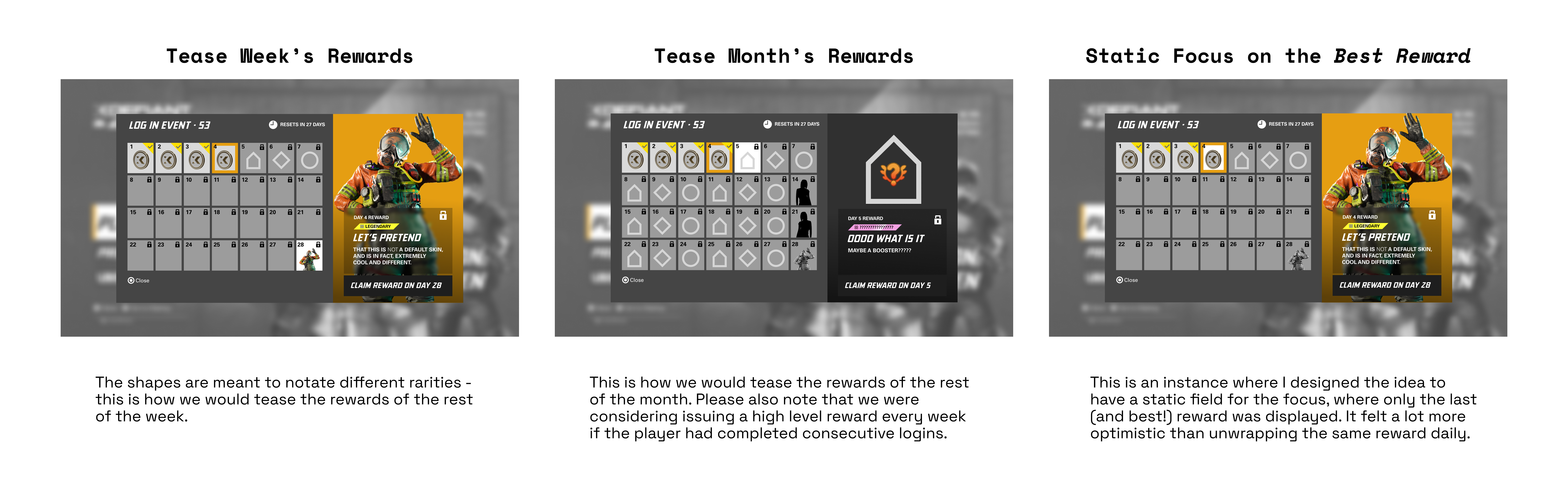
Exploration 2 — Calendar Concept
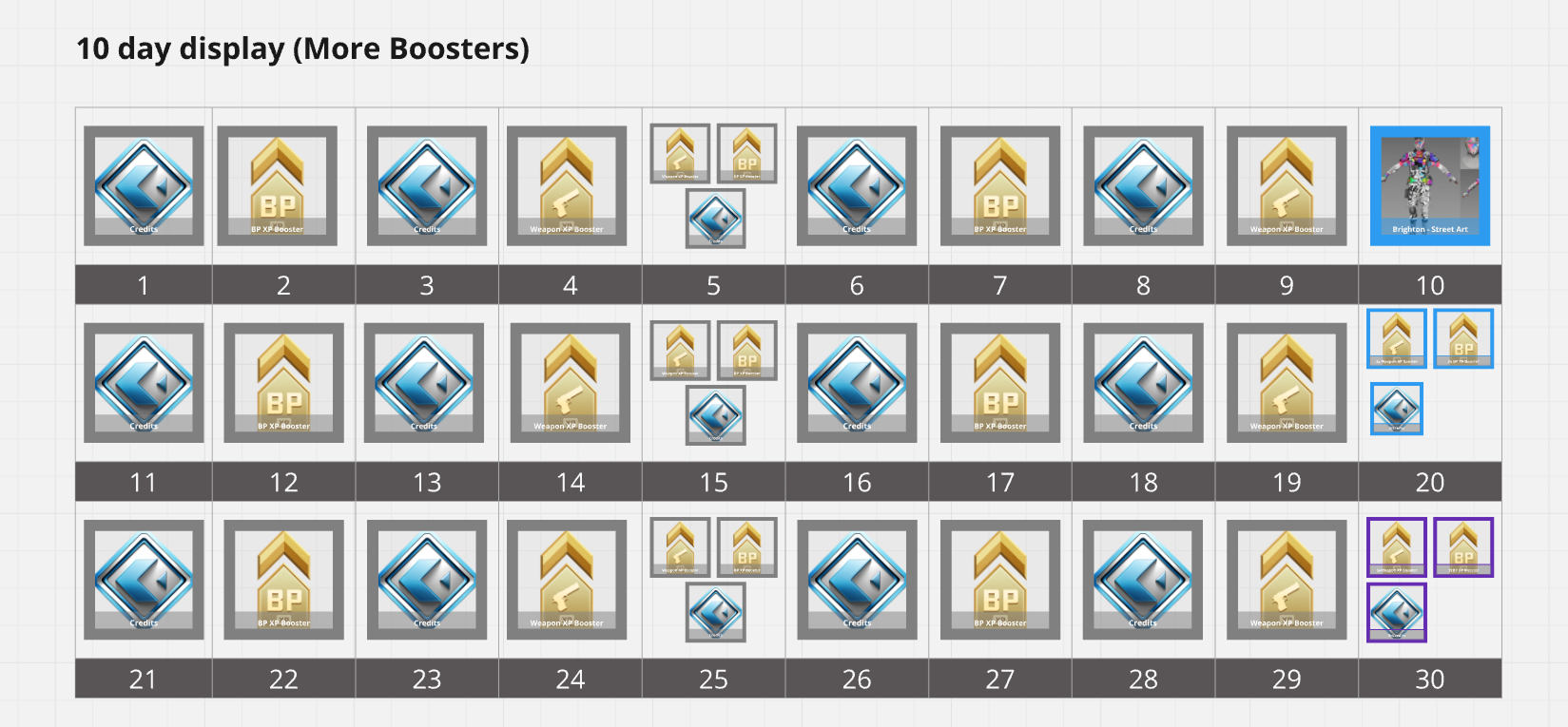
The second prototype explored a longer-range, calendar-like layout. Here, players could see a full campaign: many days of rewards, including premium milestones further out.
- Long-term visibility: Shows most or all days in the event, so players can “plan” their return.
- Milestone emphasis: Special rewards (e.g., end-of-month or streak bonuses) are called out with larger tiles.
- Grid structure: Calendar-style grid helps players understand how far they’ve progressed.
This version met MTX’s desire to support longer campaigns and generate anticipation, but it was denser and risked overwhelming new players.
Final UX — Hybrid of Weekly & Monthly
After walking MTX and the lead UI artist through both prototypes, stakeholders asked for a hybrid that combined:
- The clarity and focus of the weekly track
- The anticipation and milestone planning of the monthly view
The final UX solution mixed both ideas:
- A focused row or segment for the upcoming days, with a clear highlight on today’s reward
- Progress indicators that show how far along the overall campaign the player is
- Visually distinct milestone tiles that stand out from regular daily rewards
- Clean iconography and labels so rewards are understandable at a glance


As this project had an extremely short turnaround, I also worked with a UI Tech Artist to see what could be implemented the quickest, and why not be as resourceful as possible and reference an existing user experience? We used the Battle Pass as our basic form, and opted to reskin it to cut down on development time.
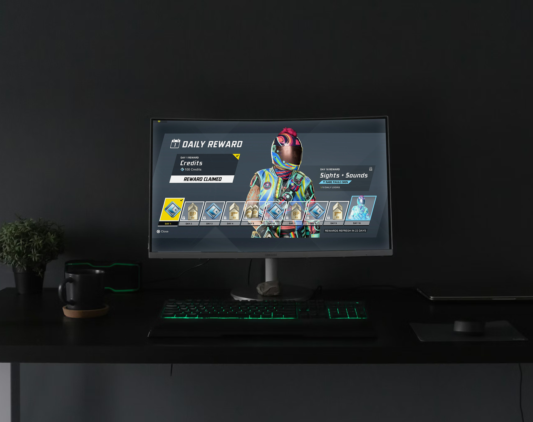
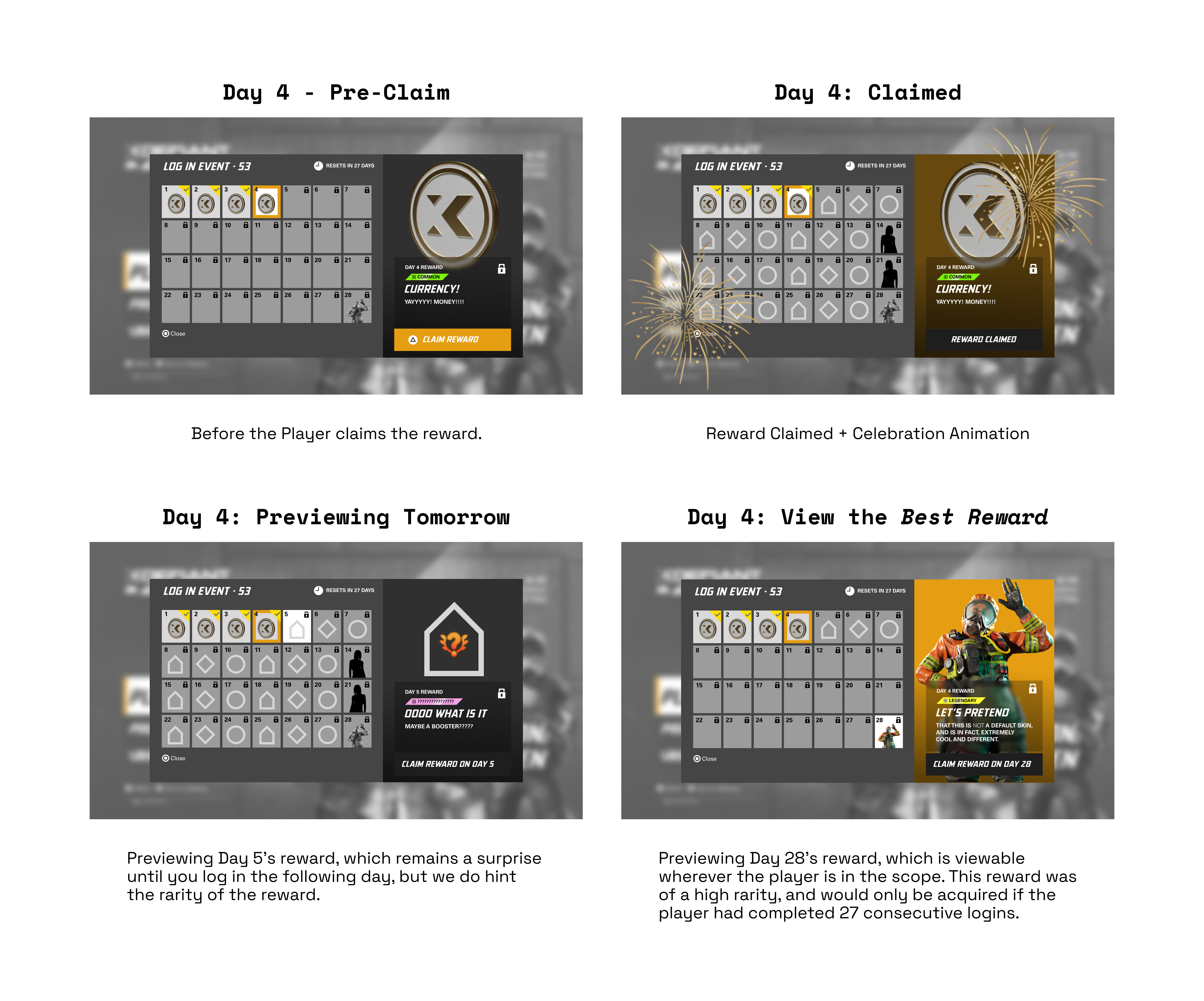
Handoff & Final In-Game UI
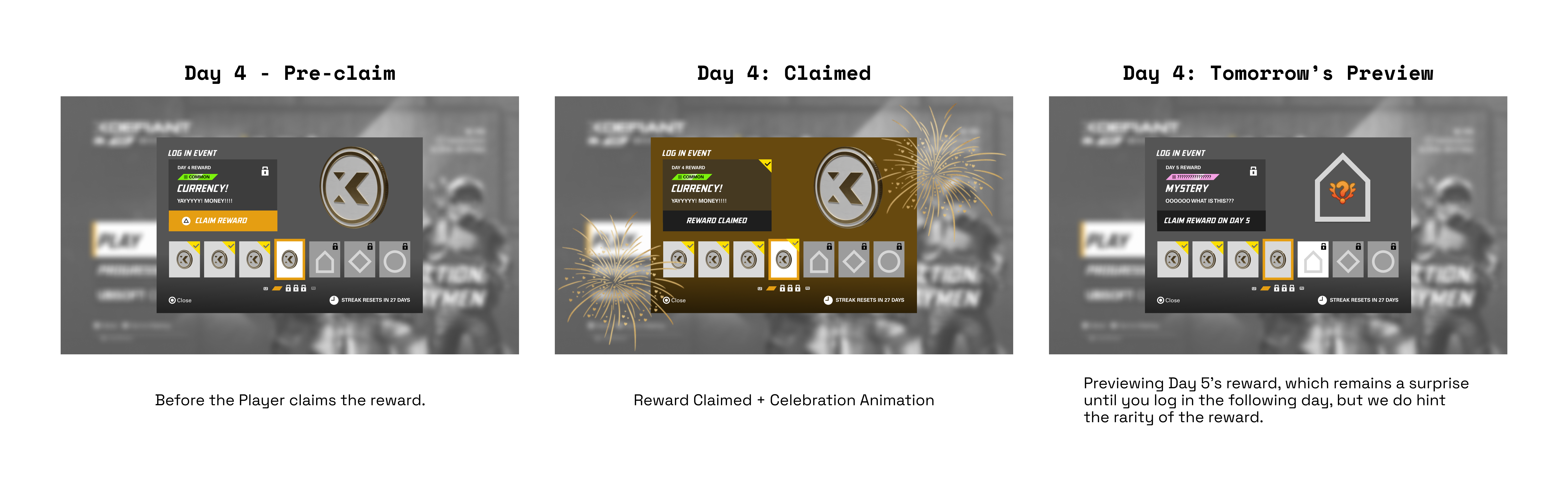
Once the UX was approved, I documented interaction states for claimed, current, locked, and milestone rewards, and handed the design to the lead UI artist.
The UI artist then applied the game’s visual style, character artwork, and motion, while preserving the information hierarchy and flows from the UX prototype.

Impact & Learnings
While MTX primarily owned quantitative results, the new daily login UX fulfilled our needs to:
- Make reward progression intuitive for the player
- Encourage players to return regularly through clear streak feedback and milestone rewards
- Give MTX enough flexibility to run both short and long campaigns without redesigning the UI
From a process perspective, the biggest win was cutting down on dev time by collaborating with tech artists to see what fit our needs the best, as well as in involving MTX and UI art early with two distinct prototypes, then converging on a hybrid that aligned retention goals with player readability.