XDefiant: Store UX
What I Started From
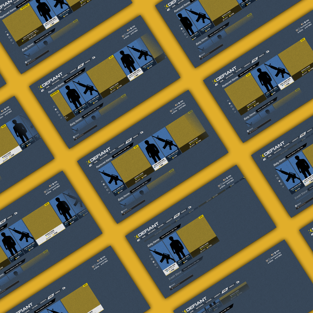
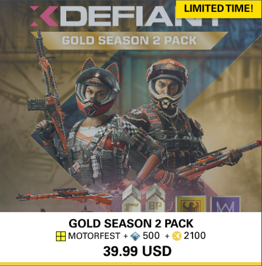
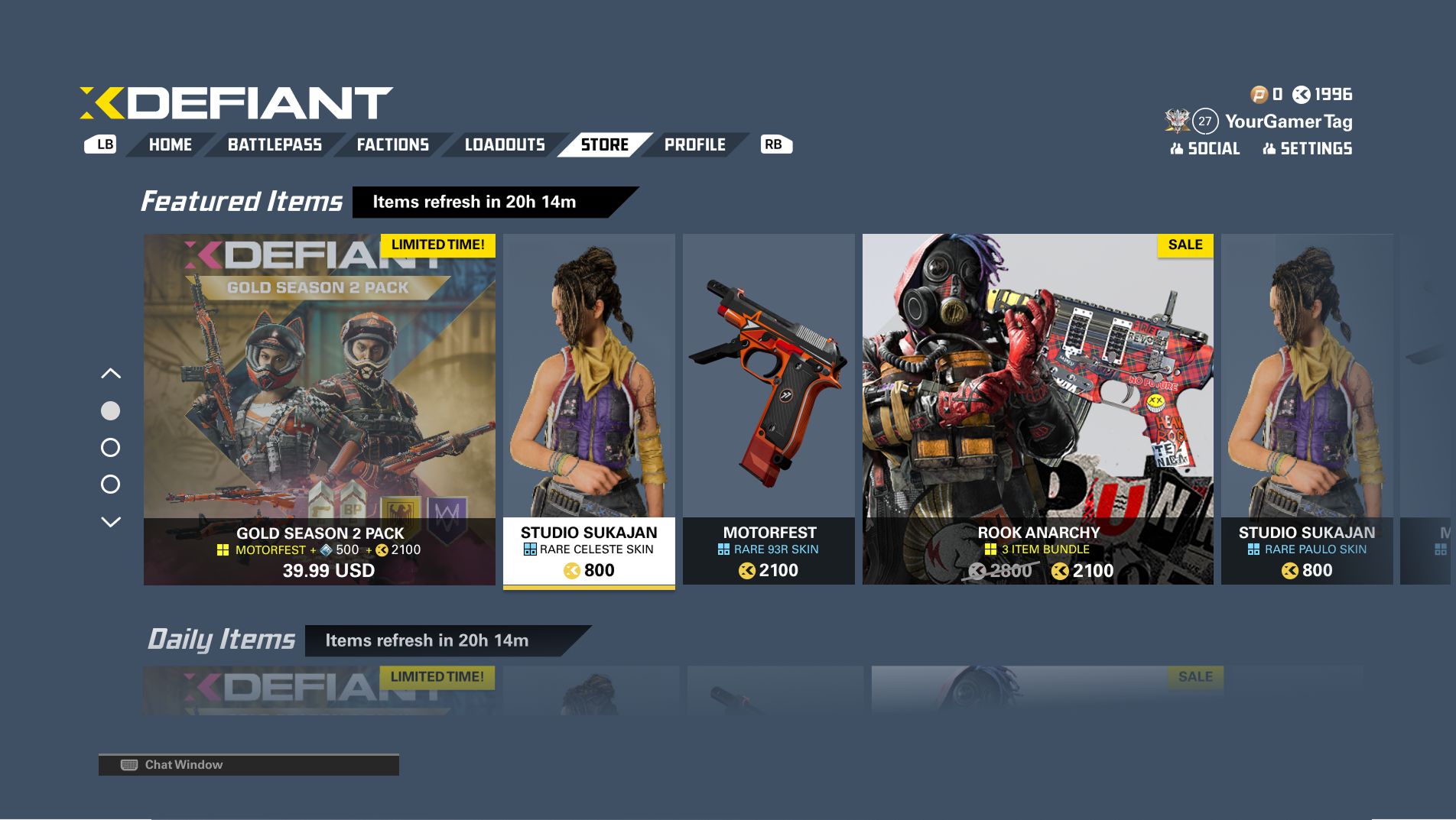
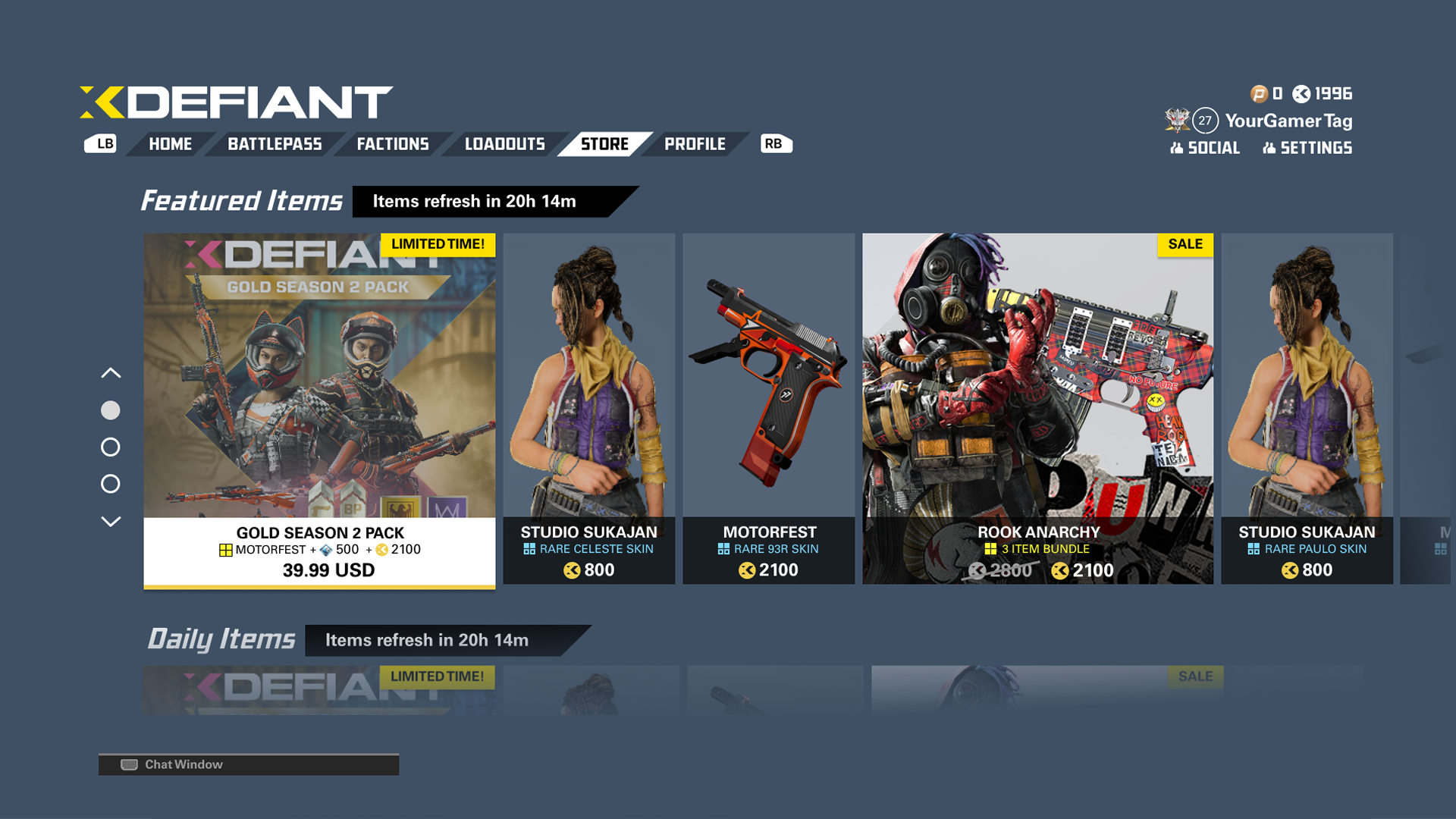
The existing bundle tile only exposed a “BUNDLE” label and a price. Everything else (what the pack contained, how many currencies it used, what was premium vs. bonus) lived in supporting UI. That worked acceptably in English, but completely broke down once Arabic and Ukrainian strings were added – the layout simply had nowhere for longer words to go.
The Team & My Role
I worked as the UX designer on this effort, partnering closely with:
- The MTX (monetization) team, who owned business goals and pricing strategy.
- One UI Tech Artist, who helped me understand what the existing store graph could realistically support.
I owned the end-to-end UX for the store refresh: auditing the current layout, mapping localization failures, redesigning the bundle structure and tile, and documenting final specs and states for implementation.
Players & Their Needs
Store work looks like “just art” from the outside, but the players here were pretty clear:
- Clarity: What exactly am I buying? Is this a bundle, a skin, a currency pack?
- Trust: Does the tile reflect the same offer in every language and platform?
- Speed: Can I scan tiles quickly with a controller and still understand value?
- Stability: Does the layout feel consistent regardless of language length?
The Problem Behind the Pretty Tile
Once Arabic and Ukrainian were added, the store started to show its seams:
- Longer strings pushed outside the tile frame or collapsed into illegible wrapping.
- Key information (what the bundle contained, which currencies were used) had to be dropped or abbreviated per language.
- The store graph was already development-heavy, so we couldn’t “just add more UI” without increasing complexity and risk.
Approach: Treating the Tile as a System, Not a Poster
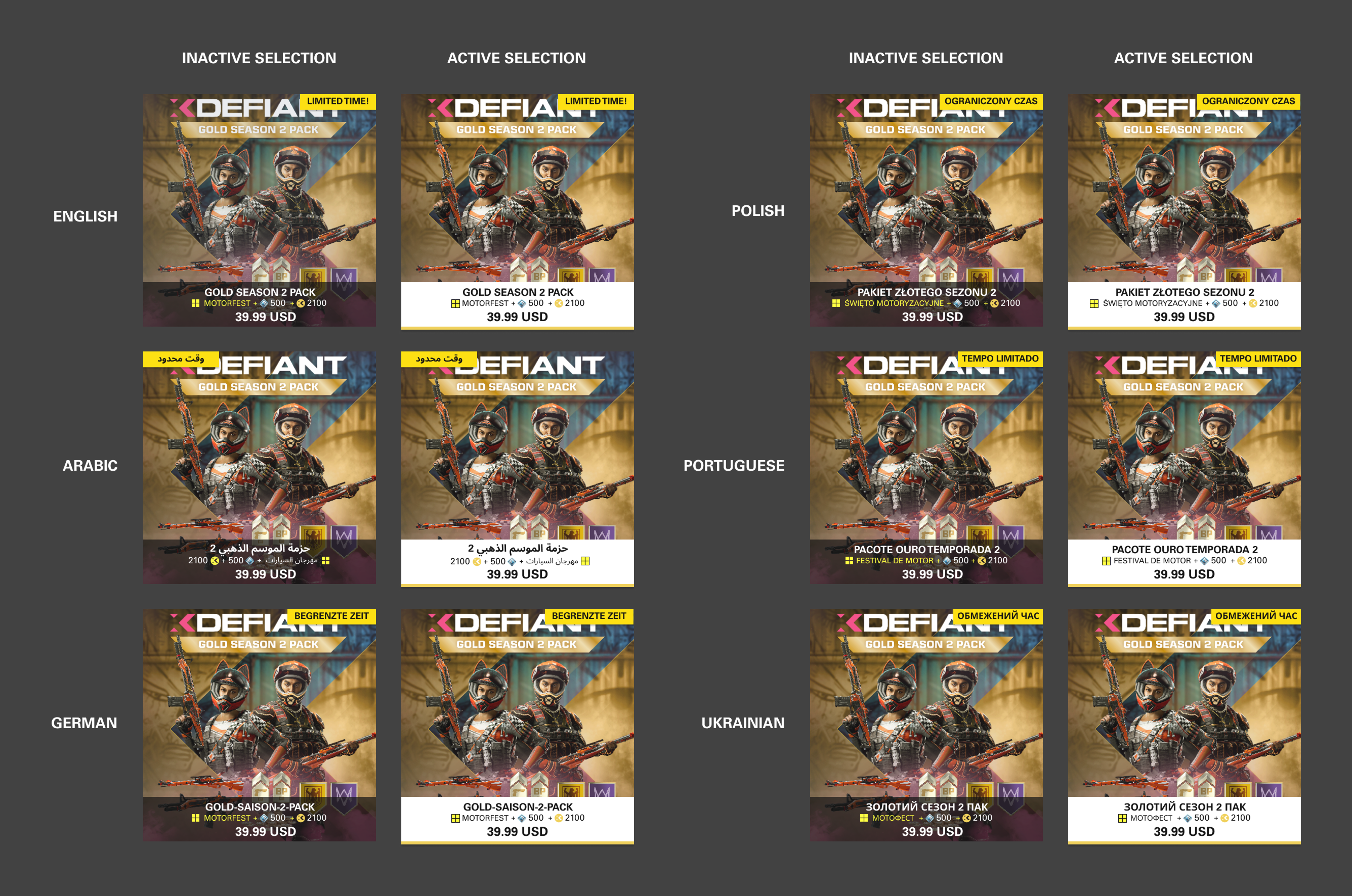
Instead of treating each bundle as a mini poster, I reframed the tile as a compact system for communicating value. That meant designing backwards from constraints:
- Localization first: Typesetting and grid decisions were driven by the longest expected strings, not just English.
- Reusable structure: The same tile template needed to work for single items, bundles, and future promo types.
- Minimal graph impact: Any changes had to sit on top of the existing store graph, not restructure it.
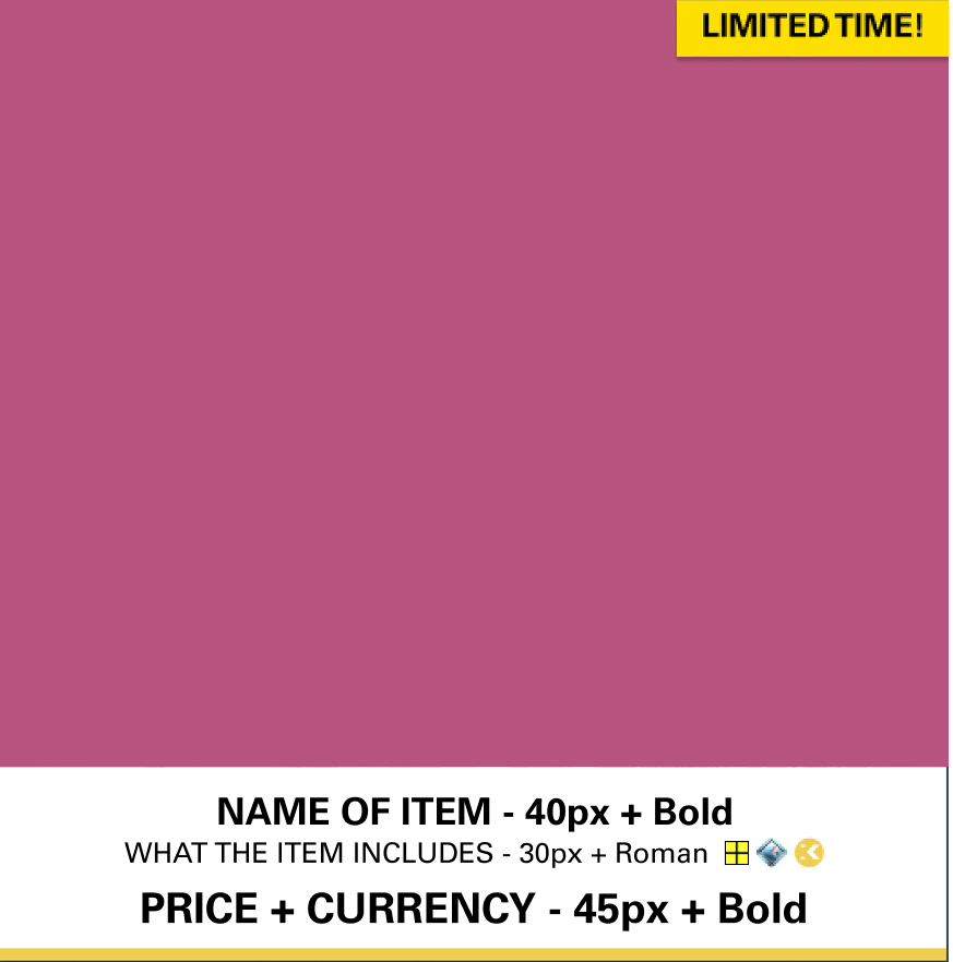
Redesigning the Bundle Structure & Product Tile
With the new frame in place, I re-defined how bundle information showed up on the tile:
- Top band: Promotional flags like “Limited Time” or “Sale”, designed to hold localized labels without overlapping art.
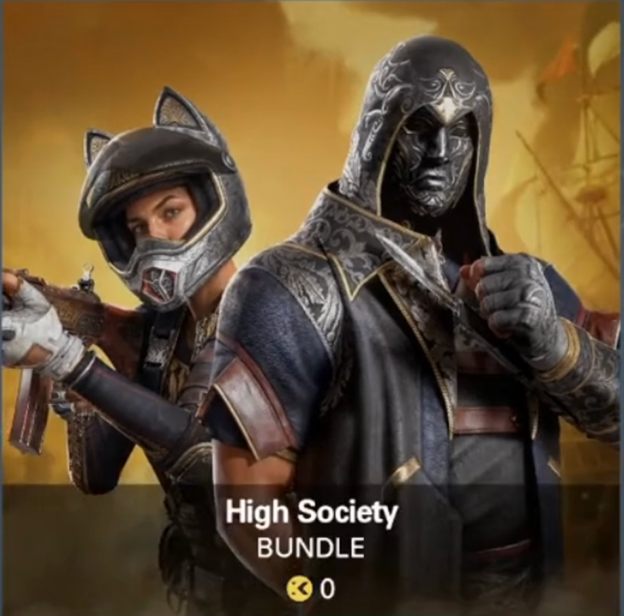
- Middle: Hero art focused on the key characters or weapons.
- Bottom white panel: Name, contents, and price, laid out on a flexible grid that could adapt to different currencies and line lengths.
With the new frame in place, I re-defined how bundle information showed up on the tile:
- Top band: Promotional flags like “Limited Time” or “Sale”, designed to hold localized labels without overlapping art.
- Middle: Hero art focused on the key characters or weapons.
- Bottom white panel: Name, contents, and price, laid out on a flexible grid that could adapt to different currencies and line lengths.
States: Inactive vs. Active Selection
Because the store needed to be fully navigable on controller, I treated the inactive and active states as part of the information hierarchy, not just a hover effect. The goal was that players could feel a clear “step up” in focus without losing legibility.
Iteration with MTX & Tech Art
I iterated on the tile and bundle structure with the MTX team and our UI Tech Artist:
- MTX pushed for clearer value communication: it needed to be obvious when a bundle contained multiple items vs. a single premium skin.
- The Tech Artist surfaced where the graph was most fragile, so I could avoid solutions that needed new nodes or bespoke logic.
- Localization reviews highlighted where Arabic and Ukrainian still needed more breathing room, so I widened the bottom text panel and re-balanced type sizes.
Constraints I Worked Around
- Heavily loaded store graph: The store was already one of the more complex graphs in the game. I had to treat every new UI element as a cost.
- Limited time to iterate: This work happened alongside other live-service priorities, so I leaned on lightweight prototypes and static mocks instead of full interactive flows.
- No major IA changes: The navigation model for the store stayed the same; all improvements had to come from tile structure and presentation.
What This Work Set Up
The redesigned store and tile system shipped internally before XDefiant was sunset in Summer 2025. Because the team was let go shortly after the release of Season 3, we weren’t able to run the long-term experiments we had planned or collect detailed metrics.
That said, the work left the team with:
- A localization-ready tile template that held up under Arabic and Ukrainian without bespoke exceptions.
- A clear UX spec for bundle structure and tile states that could be reused across future promos and offers.
- A shared understanding across MTX and Tech Art of how to evolve the store without overloading the underlying graph.
What I Would Have Done Next
If the project had continued past Season 3, I would have:
- Run more player testing around value perception. We started from localization pain, but I would have loved to run A/B tests on different ways of surfacing “what’s in the bundle” and how that influenced purchase confidence.
- Pushed the system into more edge cases. Things like free rewards, cross-promotion tiles, or bonus currency grants would have been great stress tests for the template.
- Explored a more modular store layout. The next step would have been to apply the same system thinking to carousels and event panels, so the whole store felt as considered as the tile.
Even though XDefiant was sunset, this project reinforced a pattern I keep coming back to: treat every “single screen” as a system. When the underlying logic is clear and localization is part of the design from day one, the UI stays stable even as the game and business evolve around it.