Careful Cents: UX Audit

Careful Cents audit thumbnail

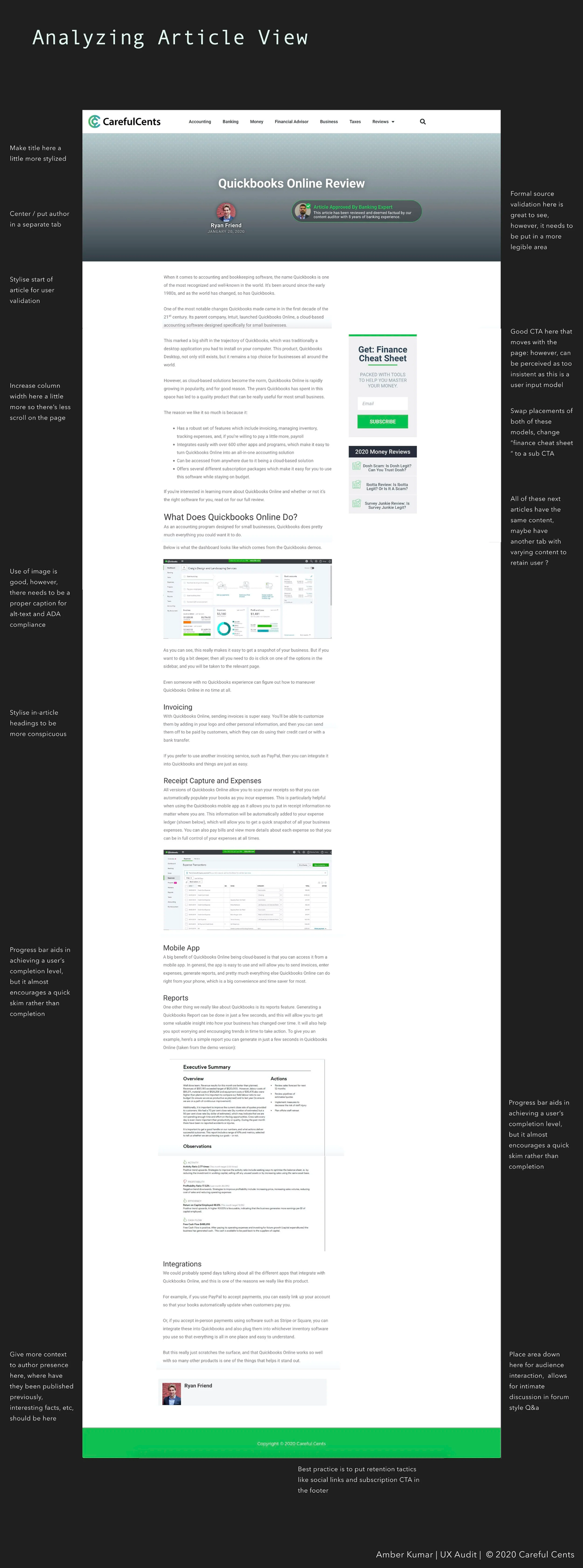
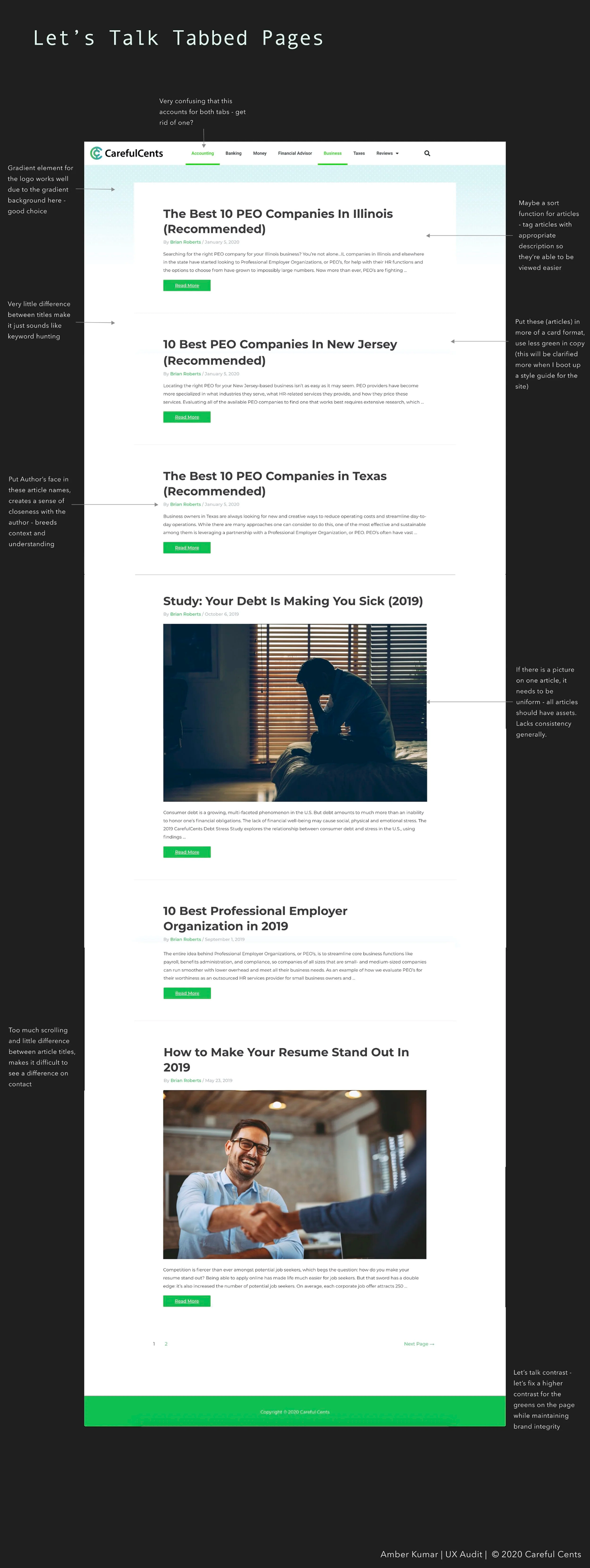
I conducted a UX audit for Careful Cents to uncover friction points before the redesign. The audit focused on branding consistency, IA, UX writing, and accessibility to create a clear roadmap for improvements.

Fintech UX Audit Redesign Web Design Careful Cents

Audit Findings & Screens

Dark slide with headings 'Problem' and 'Goals' describing IA issues on the Careful Cents site and the goal of identifying weak points across branding, IA, logos, UX, and copy. Full-page screenshot of a Careful Cents article with critique notes highlighting unclear author placement, ADA needs, excessive scrolling, misplaced CTAs, and weak hierarchy. Dark slide titled 'Concluding Our Audit' outlining next steps focused on mission clarity, improved IA, and maintaining brand integrity through relevant copy. Dark slide featuring a two-axis importance grid for guerrilla research showing user vs stakeholder values, participant results, and conclusions on discoverability and IA. Persona slide 'Meet Evelynn' showing her photo, demographics, goals, frustrations, personality sliders, motivations, channels, and descriptive tags (practical, social, adventurous). Screenshot of the Careful Cents homepage with critique annotations calling out poor CTA placement, mismatched imagery, missing context for video, and inconsistent assets. Screenshot of Careful Cents navigation bar and dropdown with notes highlighting misaligned logo, crowded tabs, intrusive dropdowns, and poor IA grouping. Screenshot of a blog category page annotated with issues like confusing dual tabs, repetitive titles, missing author imagery, inconsistent pictures, and weak hierarchy. Dark slide again titled 'Concluding Our Audit' summarizing priorities: align to mission statement, restructure IA for user expectations, and reinforce brand integrity via concise copy.