Careful Cents: Brand Bible

Careful Cents branding thumbnail

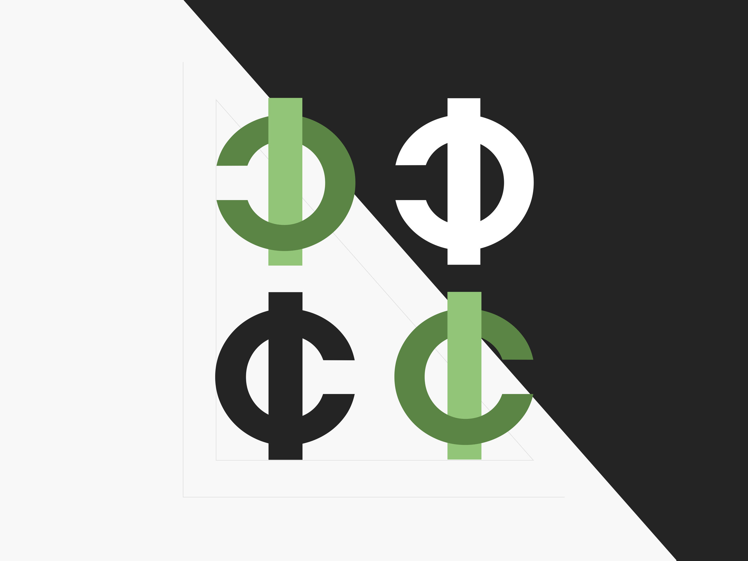
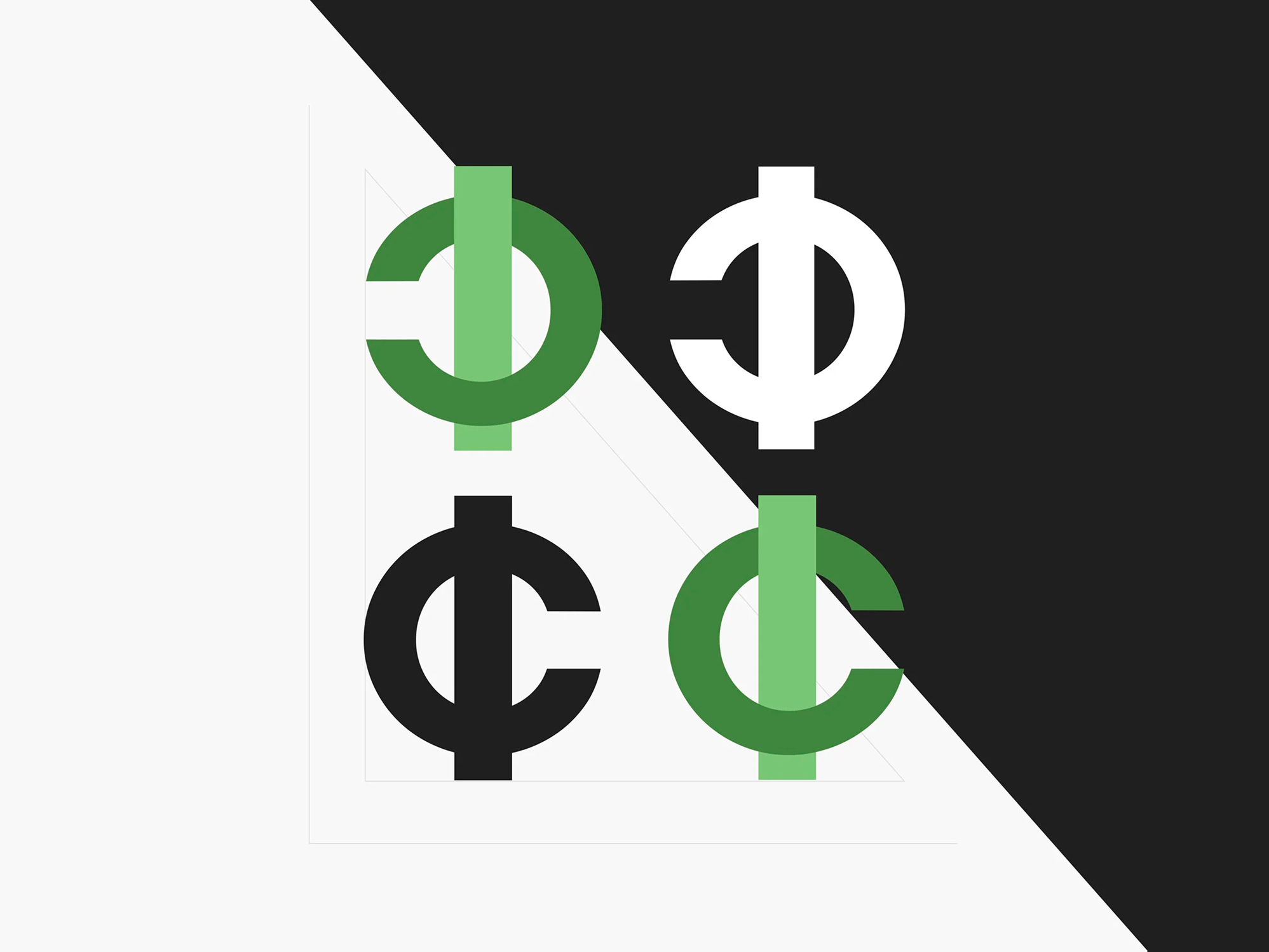
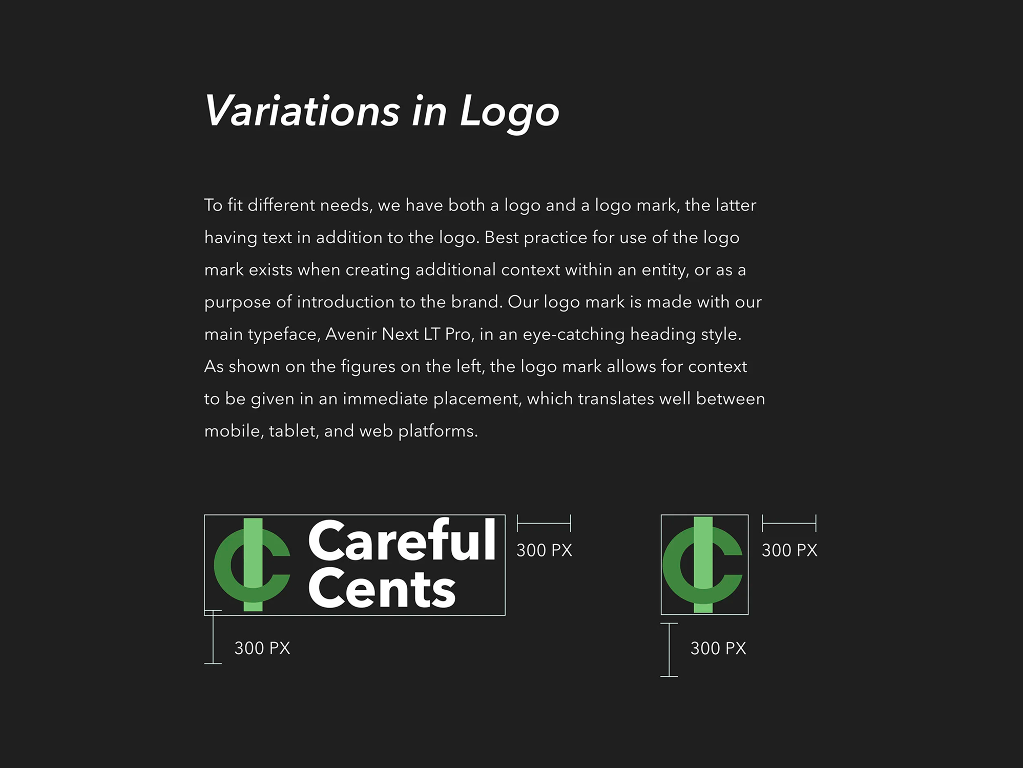
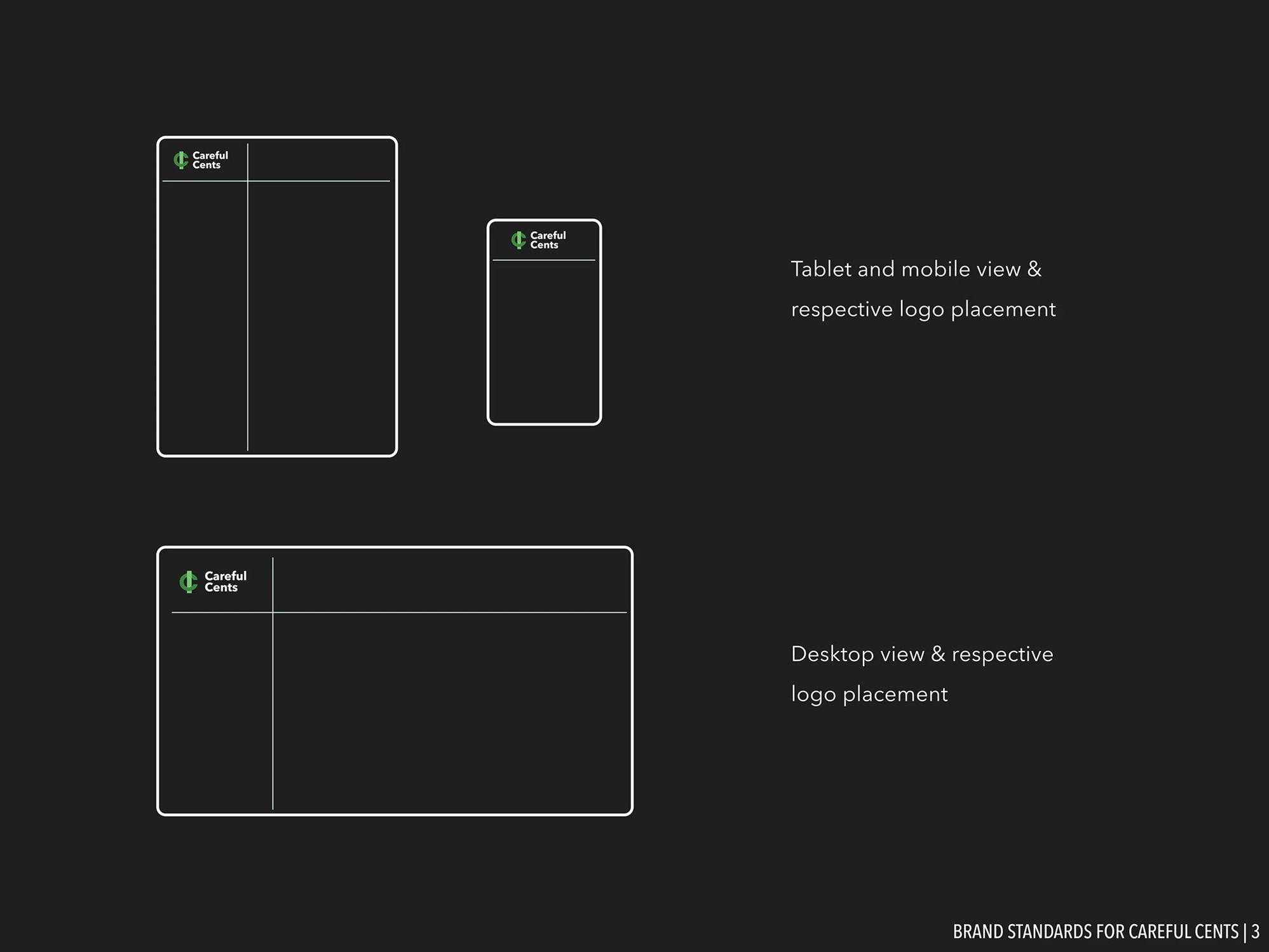
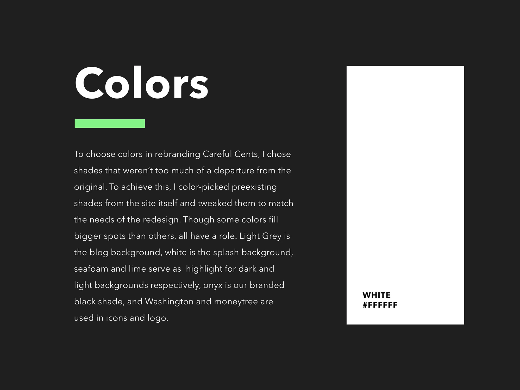
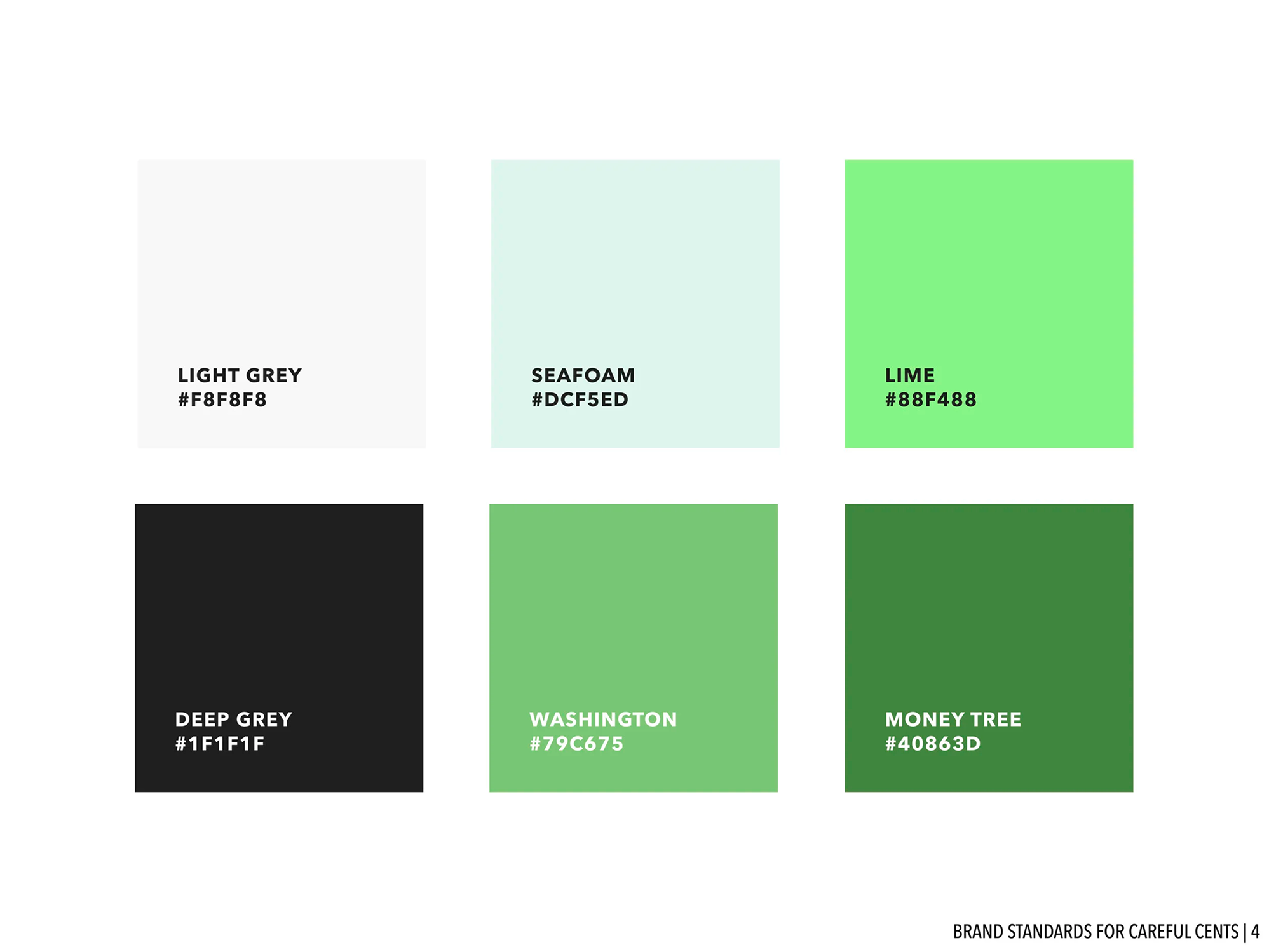
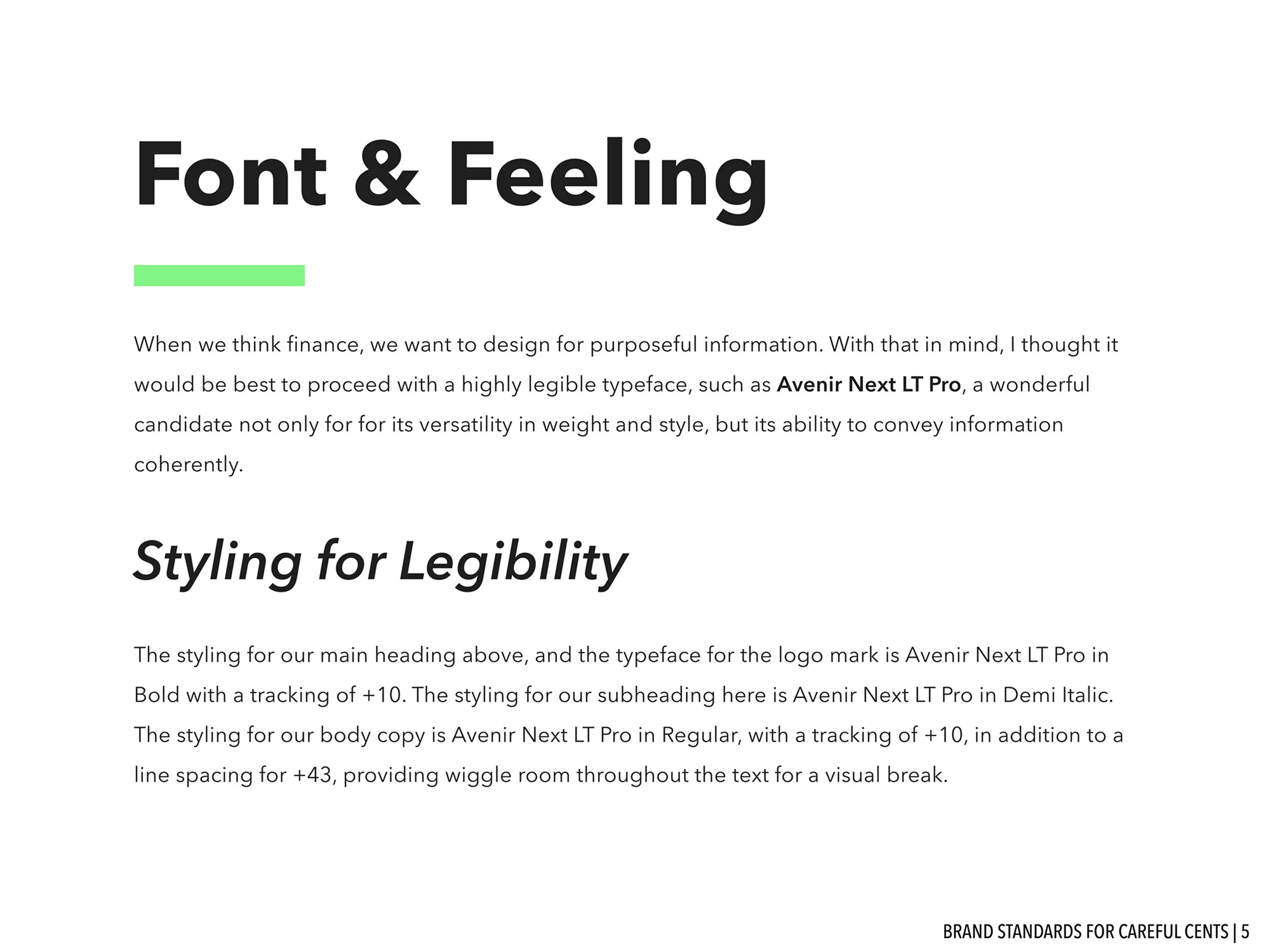
After completing the UX audit, I refreshed the Careful Cents visual system. I modernized the original colors and typography, added scalable iconography, and defined layout rules to guide the redesign.

Fintech Branding Redesign Web Design Careful Cents

Brand System & Explorations

Slide titled ‘Our Mission’ on a dark gray background with bold white text and a light-green underline accent. Centered block of body text on light gray describing the Careful Cents mission to democratize finance and refresh branding. Slide titled ‘Logo & Explorations’ on a green background discussing logo concepts inspired by keys, interlocking Cs, and a cents symbol. Grid of Careful Cents logo explorations showing sketches of keys, interlocking Cs, and stylized cents symbols with a refined gradient CC logo on the left. Typography slide showing header, paragraph, and hierarchy examples in the chosen brand font. Color palette slide displaying green and neutral swatches with corresponding values for the Careful Cents brand. Layout examples demonstrating the new branding across web components such as headers, typography hierarchy, and card-style content blocks. Grid of redesigned line icons representing the Careful Cents iconography system. Mockup of a redesigned Careful Cents homepage showing hero imagery, refreshed navigation, and updated styling. Series of UI mockups for content pages illustrating article layouts, hierarchy, and the applied visual identity. Full-page mockup showing redesigned article pages with new typography, spacing, and imagery for better readability.